The Charming Cat Corner is a non-profit organization offering cat adoption service and allow visitors to hang out with their cat residents on one-time ticket and monthly membership basis.
The goal of the cafe is to mitigate the stress level of cats throughout the normal adoption process, from their comfortable foster home to the carrier and then the shelter. So that they can show their sweetest side and ease the tension between them and their future owner.
To design a website that helps users to achieve their goals in visiting the store.
UX Research & UX Designer
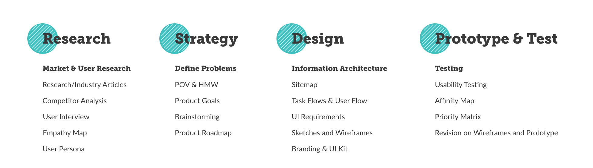
Conducting research on the market and the user's attitude and behavior provide me overall understanding of the cat lounge scene in the states and help me discover opportunities to display information on the website according to user's goals, needs, motivations, and painpoints.
To identify the target demographics
To understand the in-person and online experience of users in terms of goals, needs, motivations, and the frustrations of our target users.
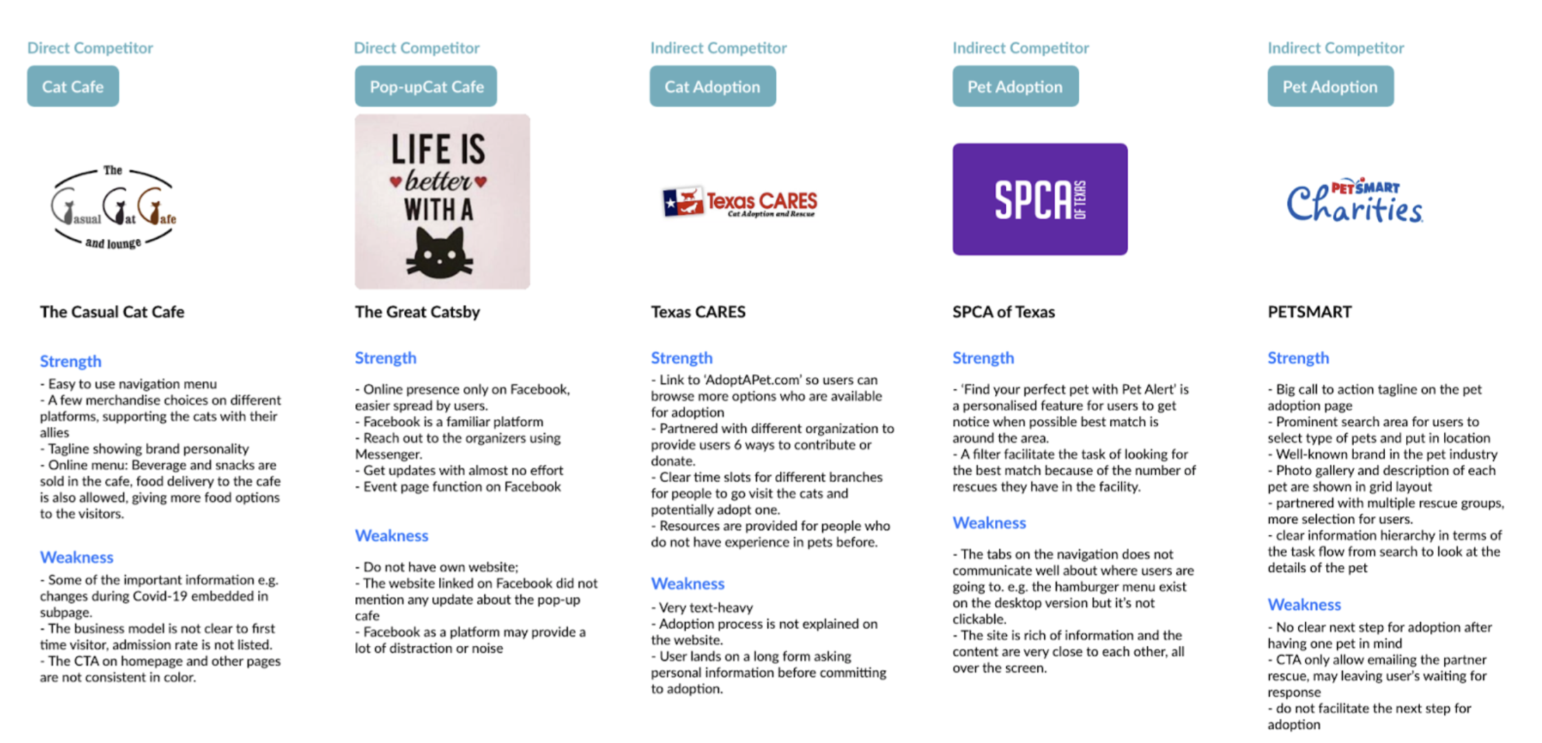
To identity the direct and indirect competitors
Pet Adoption
Lorem ipsum dolor sit amet
Lorem ipsum dolor sit amet
Pet Owner by Age Group
Lorem ipsum dolor sit amet
The Trend of Cat Cafe
After learning more about the current trend and the thoughts about our users, I drafted an Interview Agendaincluding interview scripts and a handful of open-ended questions for my participants to take part in user interview as my primary research.
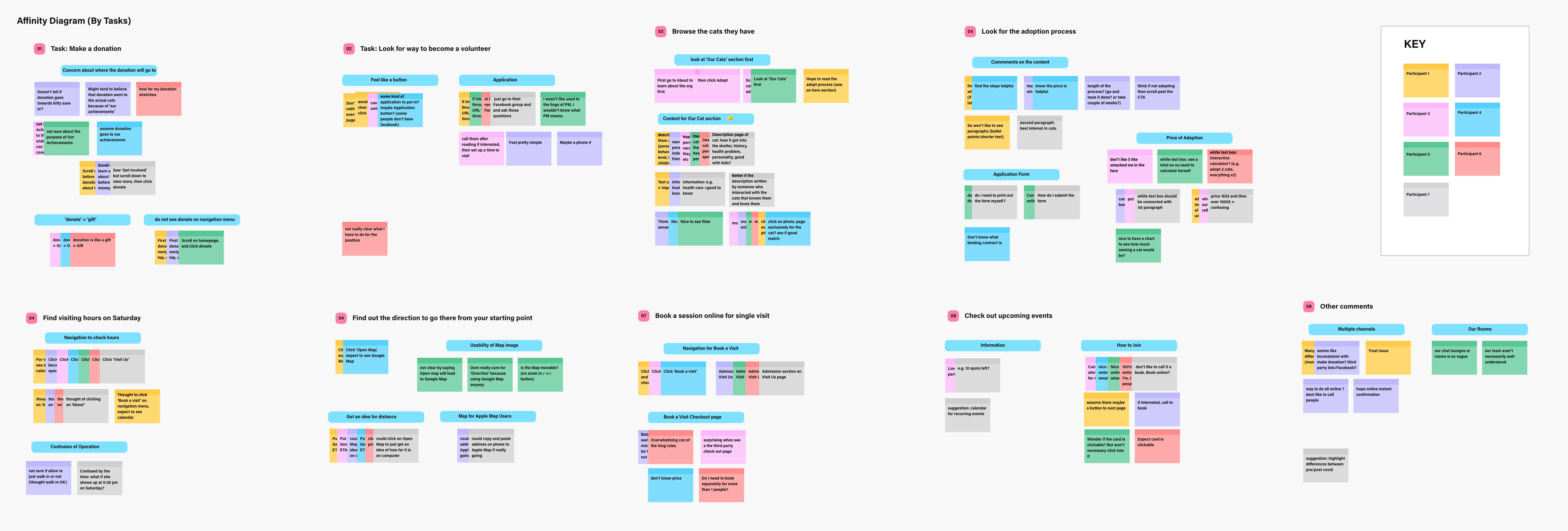
Affinity Map
Affinity Map
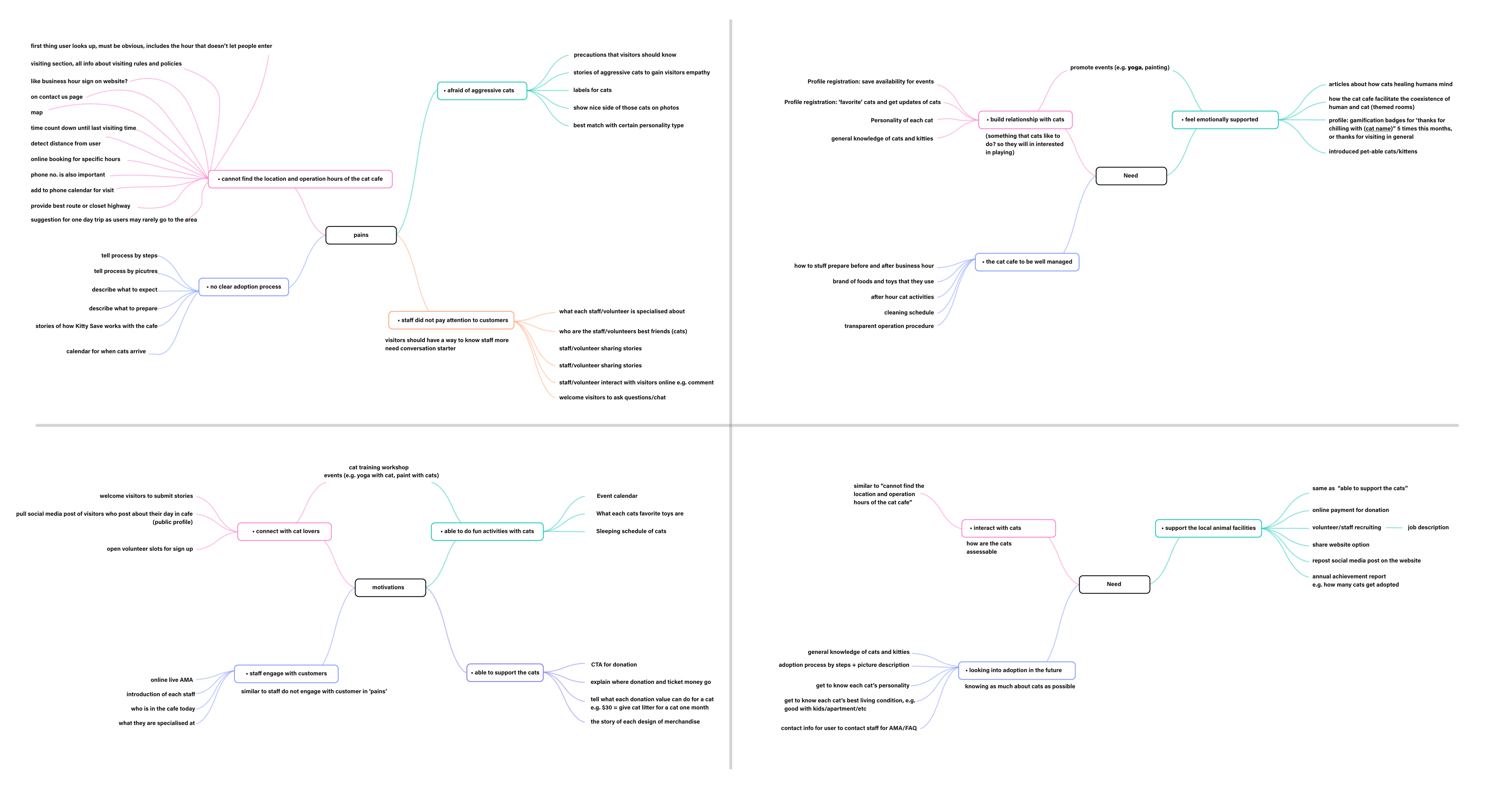
I created an empathy map to synthesize the transcripts of the user interview. The patterns were found across the participants to help me uncover users needs and insights for later strategy and design phases.
User Insights
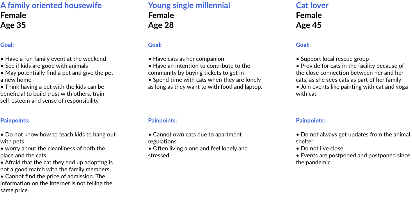
User Persona
User Persona
To define what problems I get to solve for our users, I framed point of view (POV) statements from our persona, Kelly's perspectives. Each statement was derived from the user's needs, and each statement helped me redirect user's point of view into How Might We (HMW) statements to see what problem I should solve for the users.
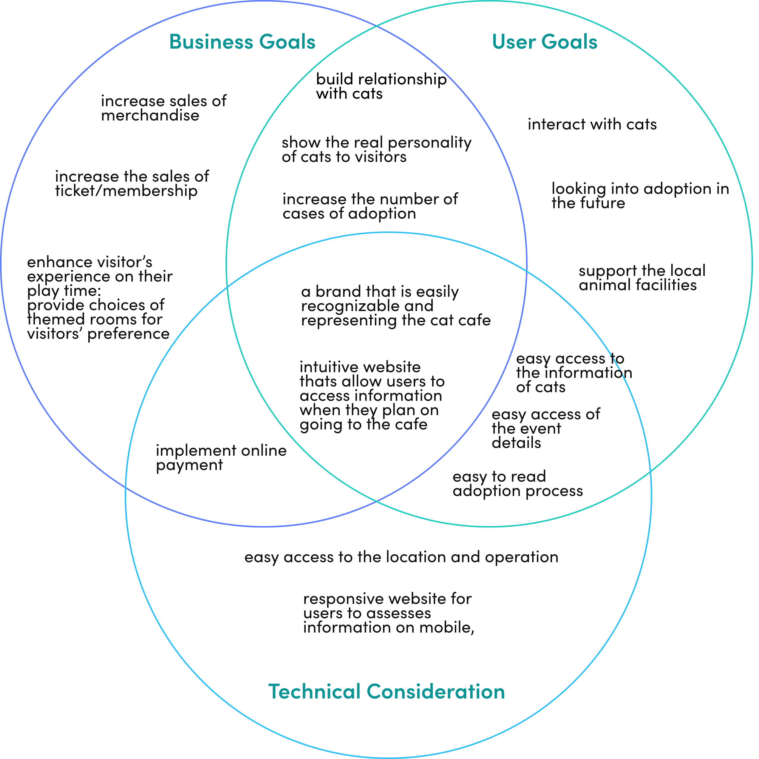
To ensure that the website is going to bring value to both the organization and the users, the goals of both the organization (business goal: through interviewing the stakeholders) and the users (referred to user persona) are placed as shown in the followings to further set the direction of my design. The overlapped area would be the main focus of the website.
Understanding the project goals and having the How Might We questions, I set the scope to brainstorm features and ideas for the website, having the user's goals, needs, motivations and pains in mind.
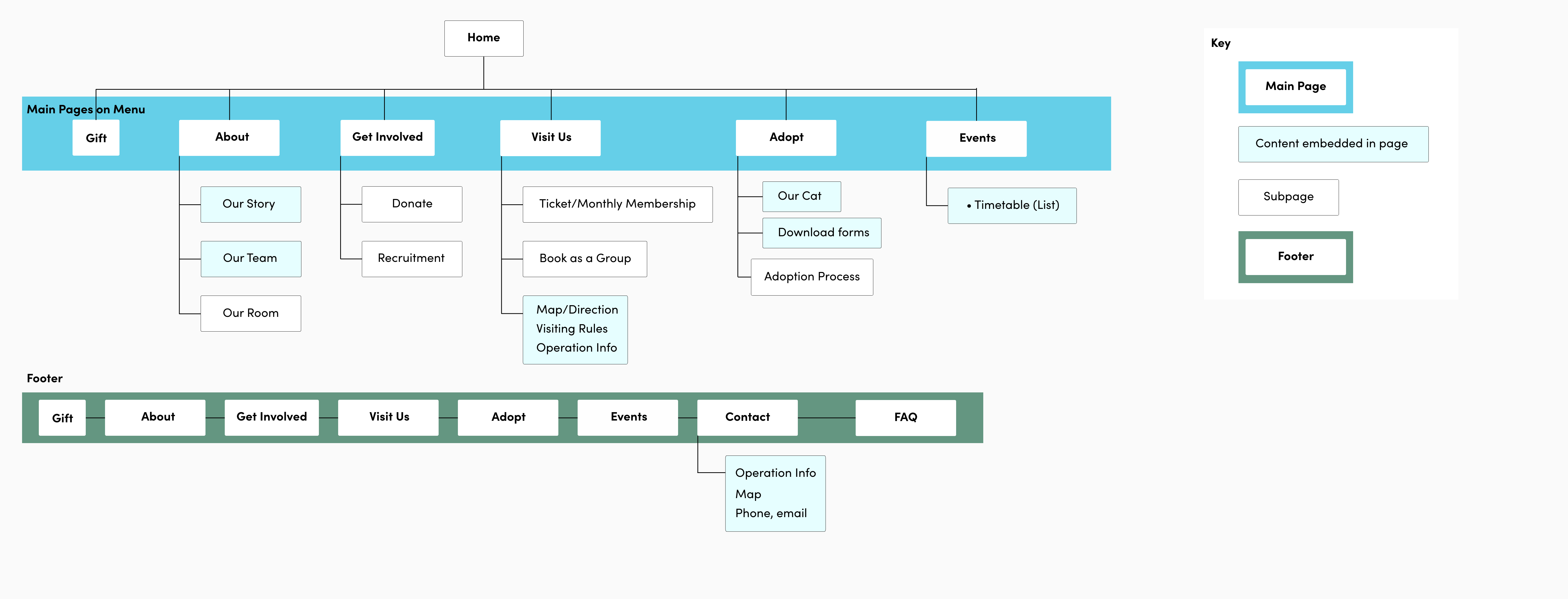
Having an idea of what features are included in the website, it is time to work on the information architecture of the website, which is the structural design of the content in order to help users easily navigate and look for information. The pages were arranged based on user main goals and also the pattern observed from competitors' websites.
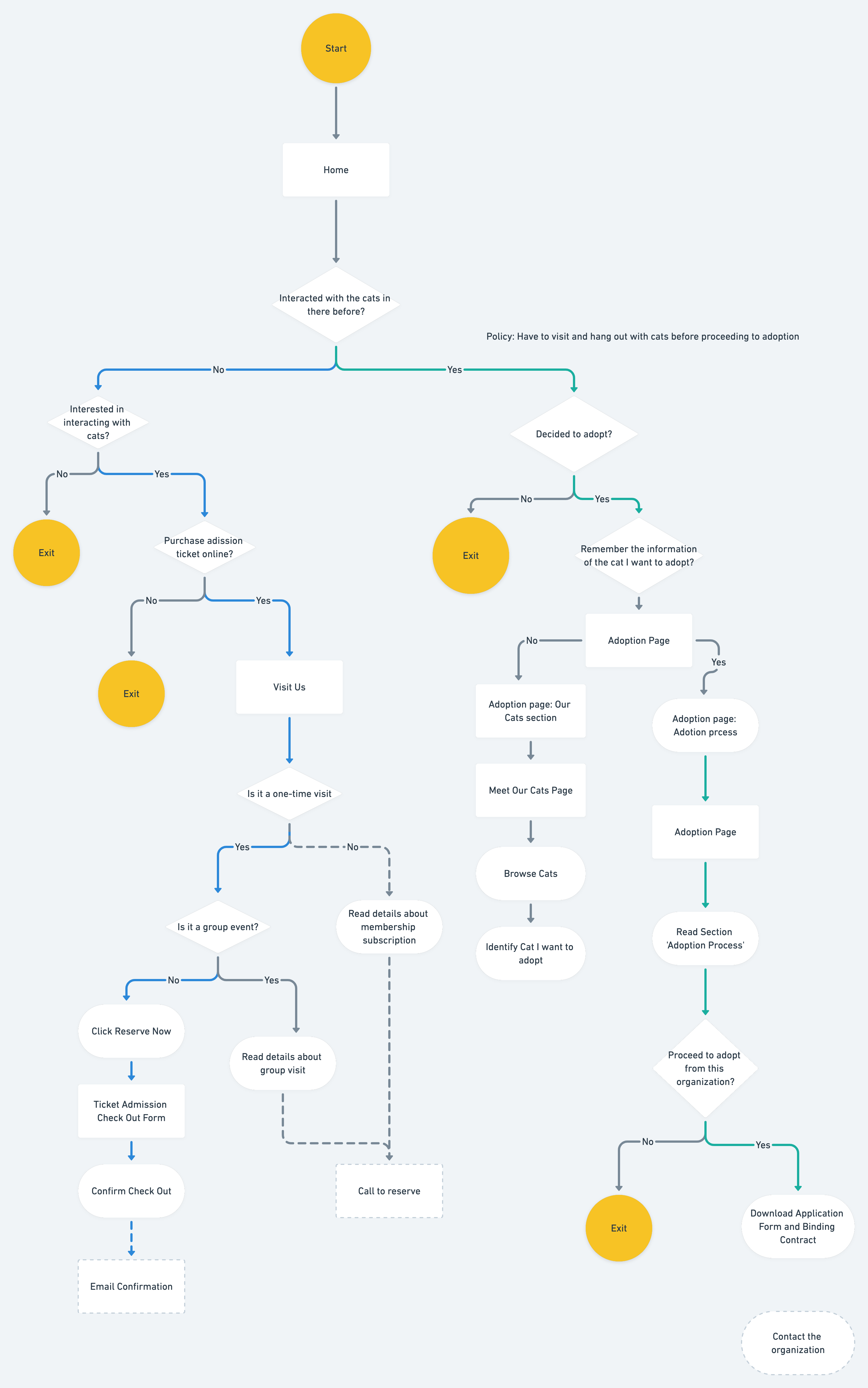
To visualize the navigation of the website from the user's perspective – our persona Kelly, I created the seven tasks flow in order to fulfill each user goals (to visit, to adopt and to support the facility). The tasks represent the key functions and their necessary steps of the website, allowing me to plan the pages with the structure of sitemap as a reference.
The UI Requirements of the key pages are documented to define what elements the page should include and what the users can perform for each elements.
See UI Requirements.
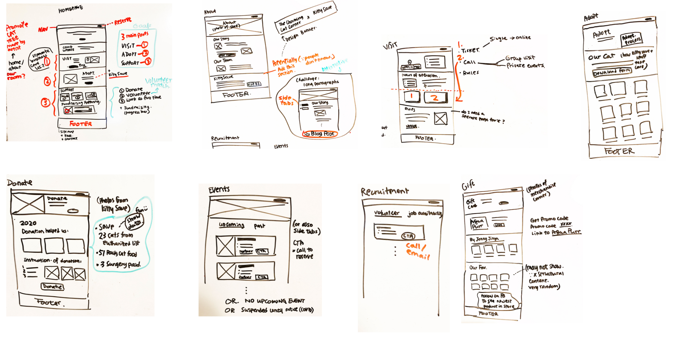
Sketches and Mid Fidelity Wireframes
Having the user tasks and UI requirements laid out, I created some sketches to explore ideas of what the interface would look like before I moved them onto the actual screens.
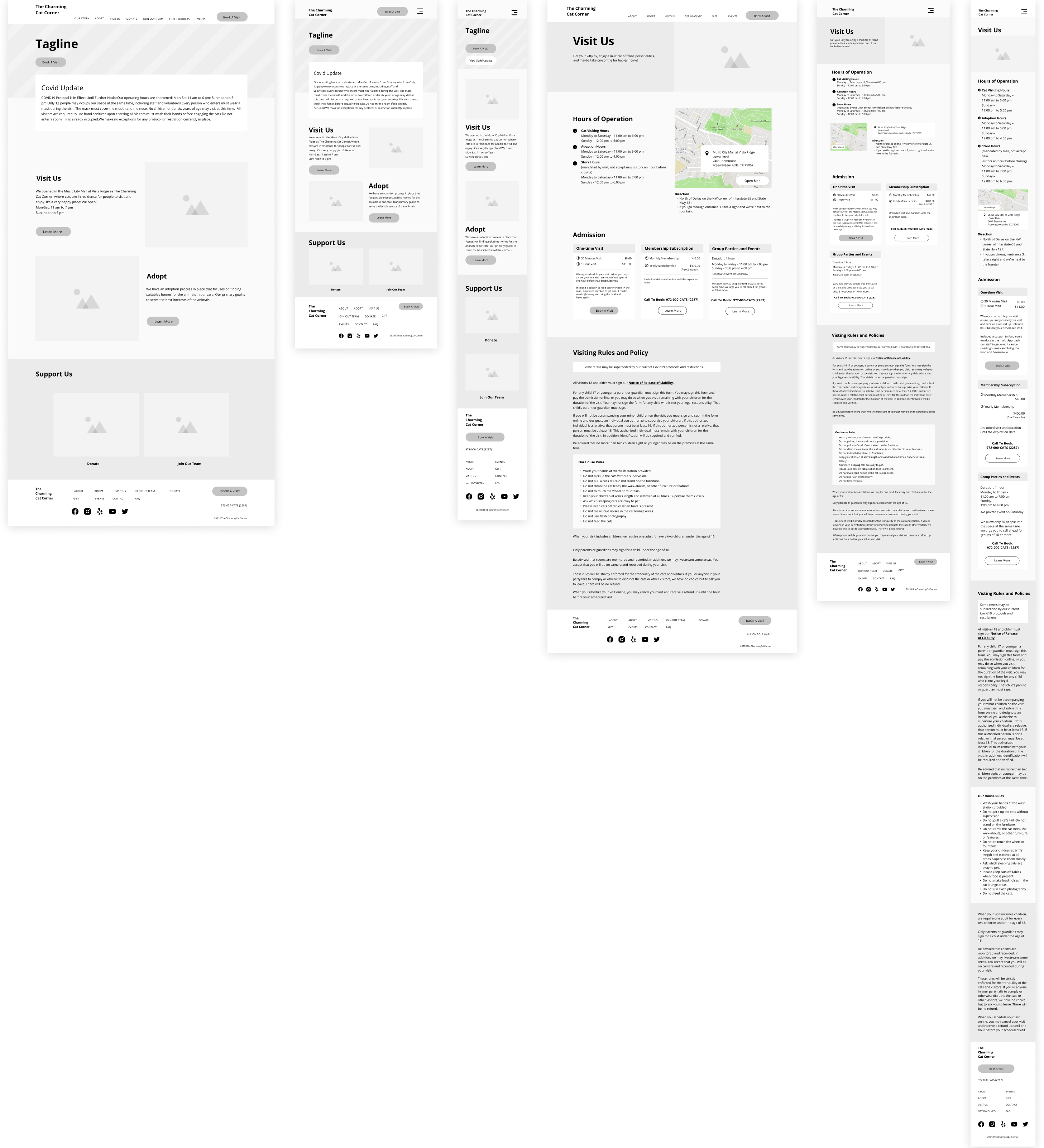
More details and contents were implemented on the mid-fidelity wireframes in order to explore the visual hierarchy and to plan the reusable components for the hi-fidelity version.
Mostly importantly, this version of wireframes would be made into workable prototype for usability test at a later stage before getting polished with colors and other visual elements. Since the website serves an informative purpose, testing mid-fidelity version allows the users to focus more the navigation, content and visual hierarchy without the noise brought by the color, font type, etc.
Low Fidelity Wireframes (Sketches)
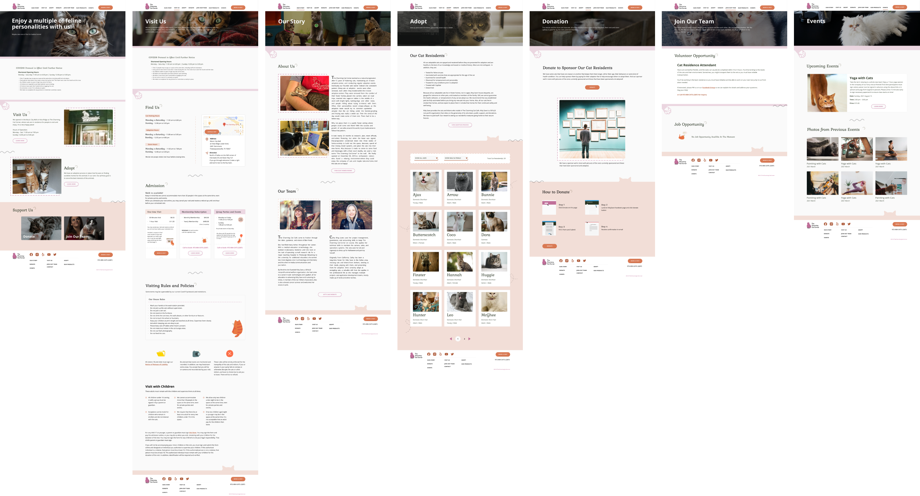
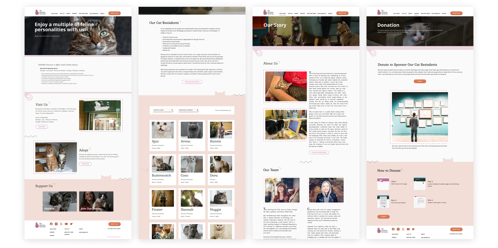
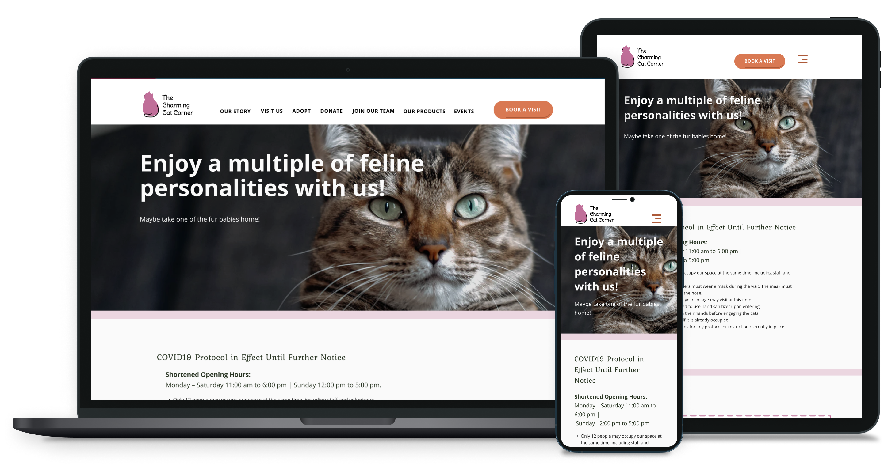
High Fidelity Wireframes
The Mid-fidelity prototype was made and used in the usability test.
3 scenarios with totally 8 tasks identified in the UI requirements were the focus on making the prototype functional.
See prototype.
Objectives
Participants
See detailed usability test plan and usability test transcripts.
Lorem ipsum dolor sit amet, consectetur adipiscing elit. Suspendisse varius enim in eros elementum tristique. Duis cursus, mi quis viverra ornare, eros dolor interdum nulla, ut commodo diam libero vitae erat. Aenean faucibus nibh et justo cursus id rutrum lorem imperdiet. Nunc ut sem vitae risus tristique posuere.
Like empathy map, each participant has own color notes and I used bottom up method to categorize them to identify insights. Recommendations were then decided to improve each user insight.
The transcripts were broken down into groups in order to find patterns and insights when users interact with the prototype. Through the insights, I hope to find opportunities for improvement and reiterate the design.
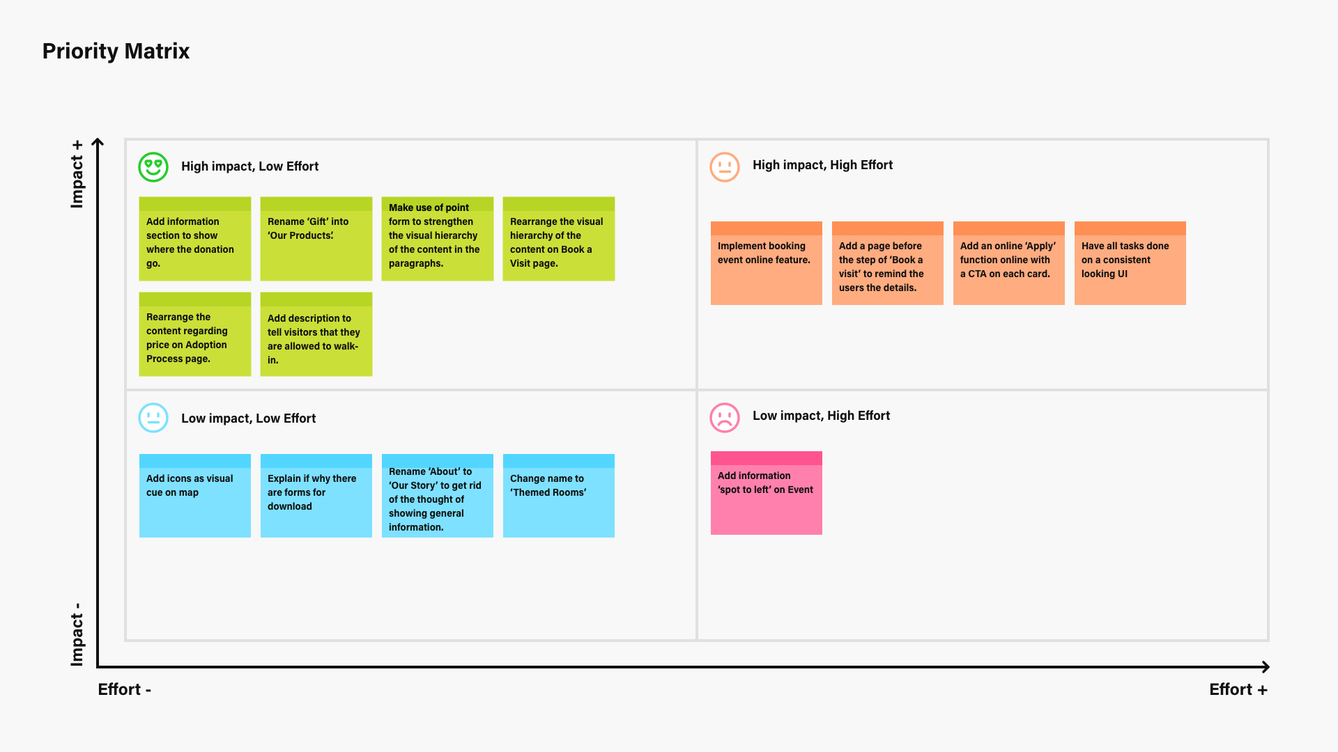
To see which recommendations were worth working on first, I created a priority matrix and arranged them in terms of effort to spend and the amount of impact the revision would bring.
Here are some highlights of the changes I have made on the wireframes based on the recommendations.
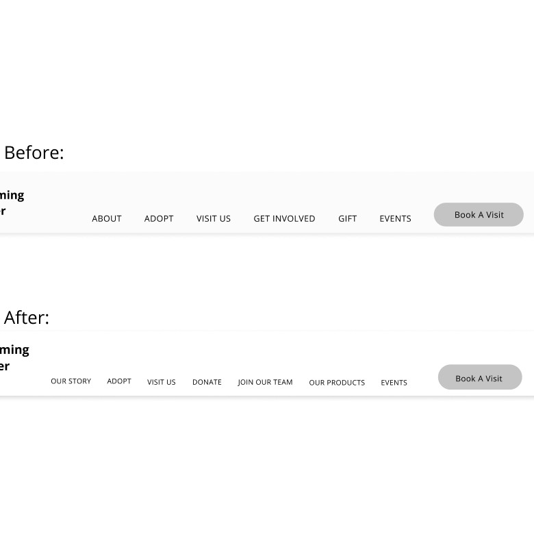
Frustration:Users mixed up 'Gifts' with 'Donation'
Change:Rename 'Gift' to 'Our Products'
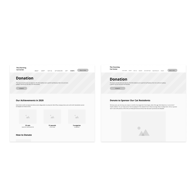
Frustration:Users want to know where their donation goes to directly
Change:Communicate with the organization to understand how the donation will be used so as to change the content accordingly to show what users want to see.
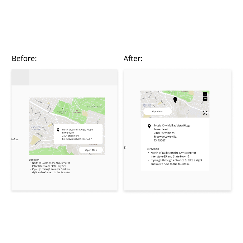
Frustration:Users thought the map is not interactive
Change:Add icon as visual cue
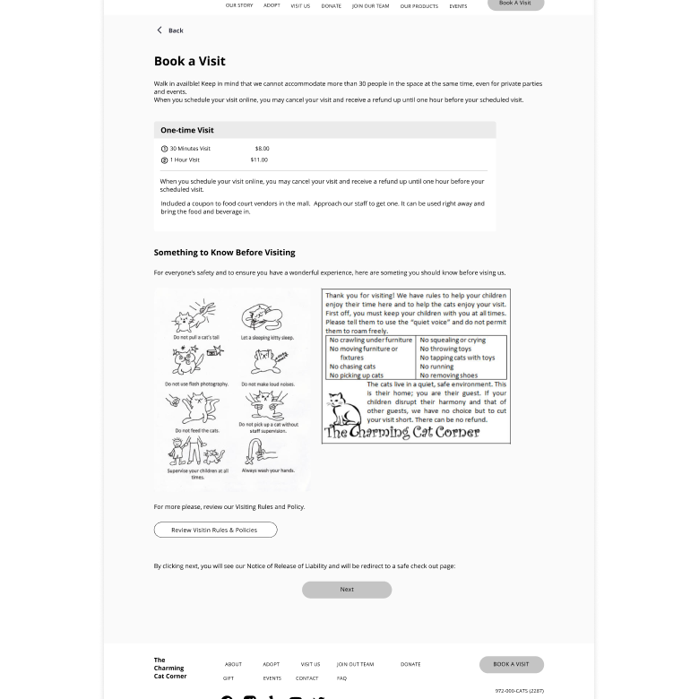
Frustration:Users do not know the details of payment on the third party checkout page in booking process.
Change:Add a page before the step of 'Book a visit' as a confirmation page
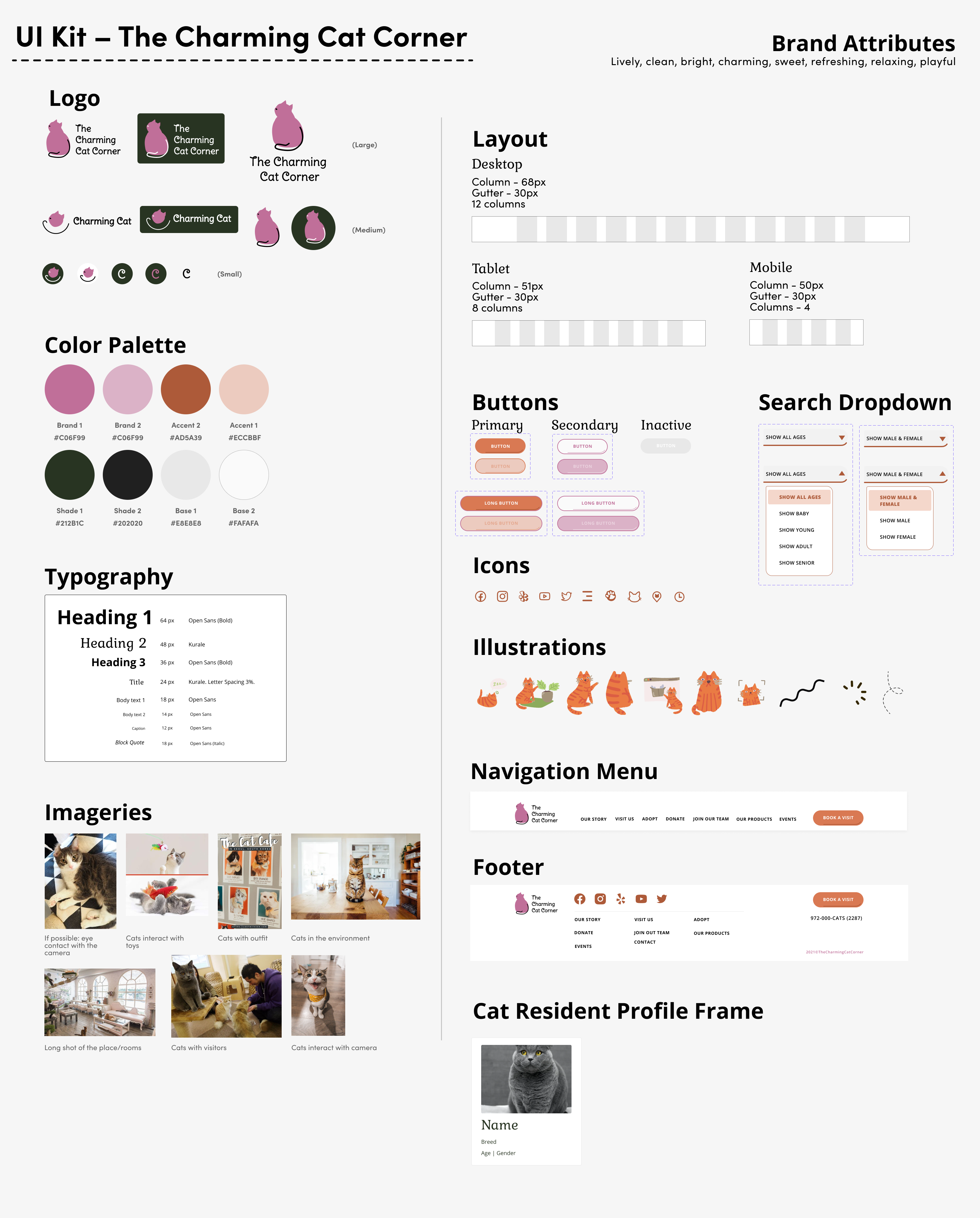
To start making the wireframes into high fidelity version, I started with listing out the brand attributes expressed by the organization and participants in the interview, and made a moodboard andto define the visual direction for the brand and design. From there, I developed a UI Kit specifically for guiding me while I was making the hi-fi wireframes. UI kit consists of reusable elements which helps the pages stay consistent, and facilitate collaboration work in the future.
Brand attribute: