KAUS

Responsive Web Design for an Insurance Company

Project Overview

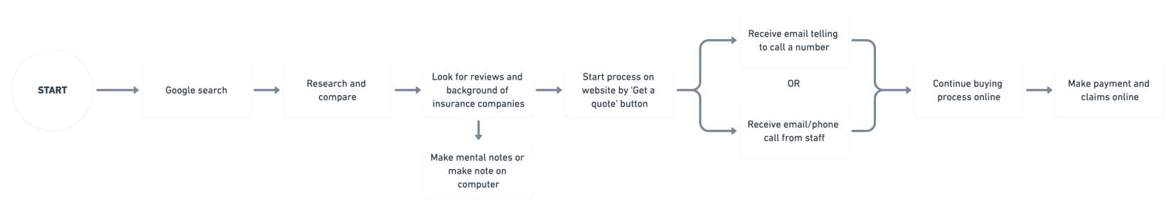
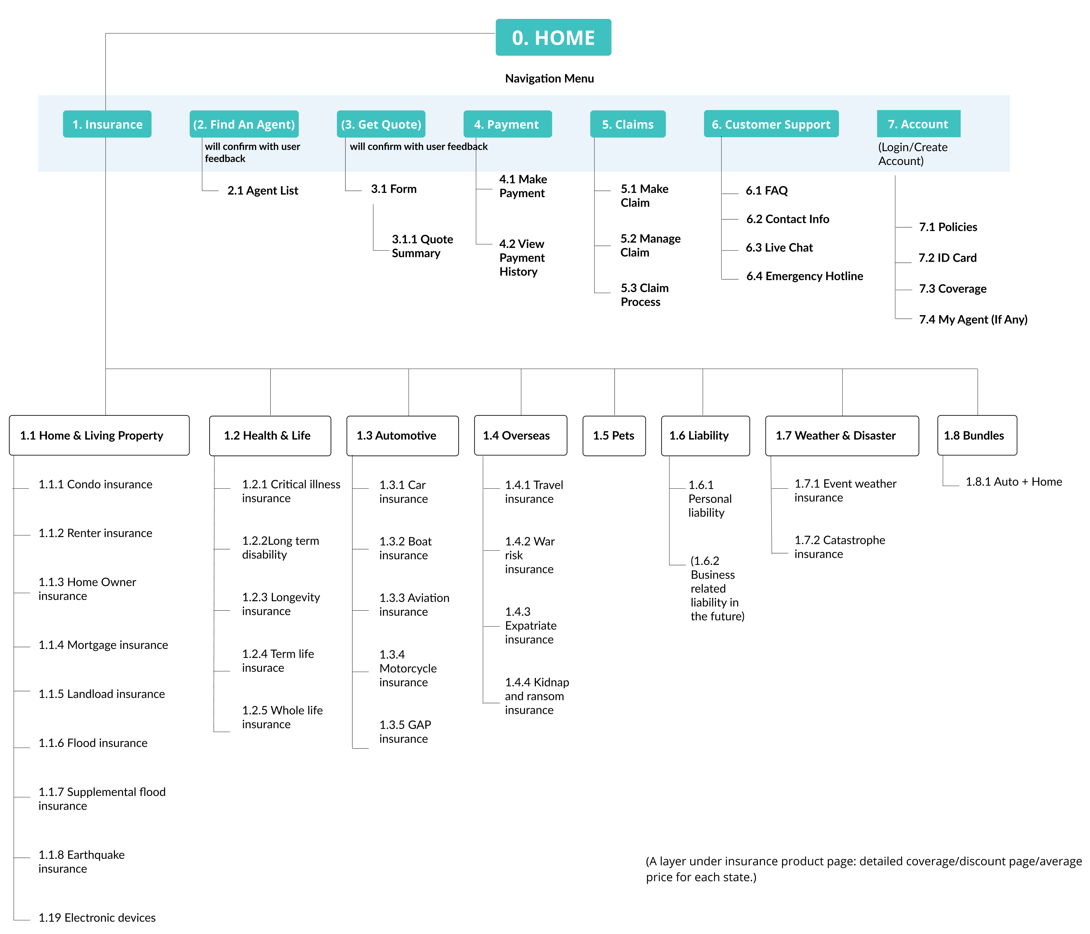
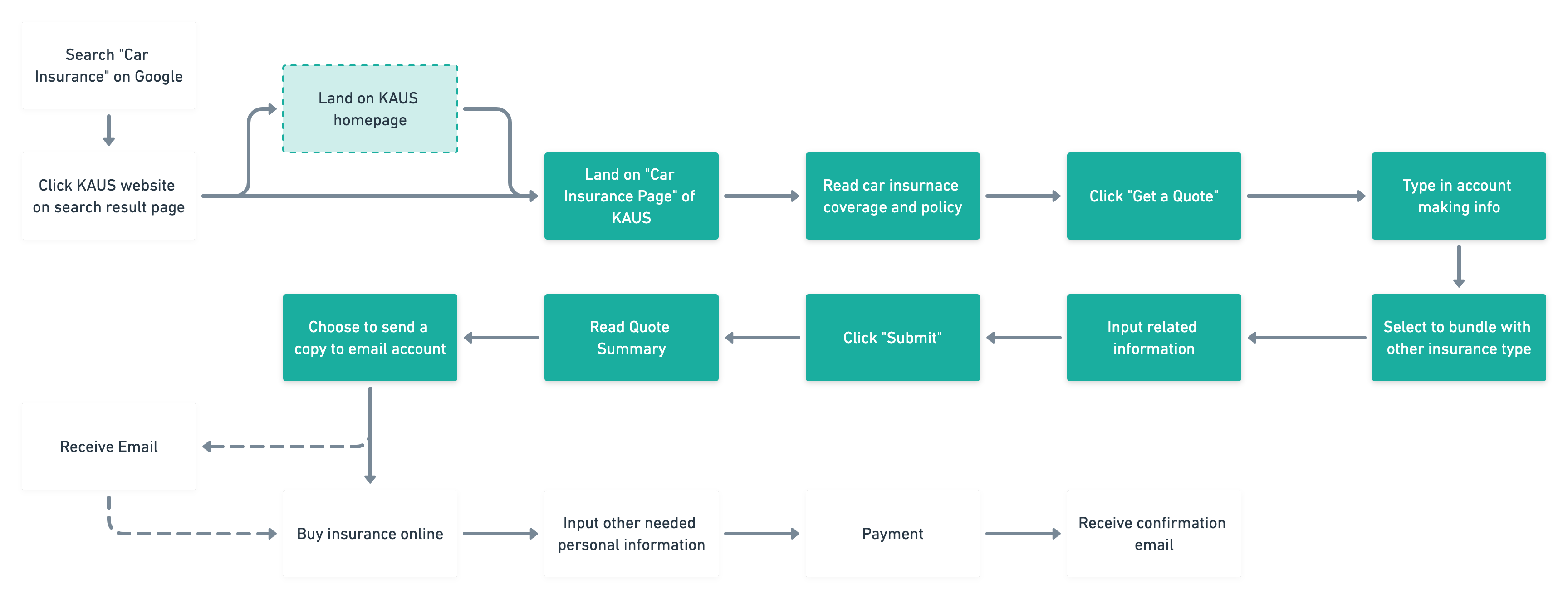
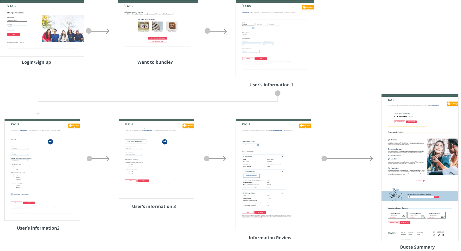
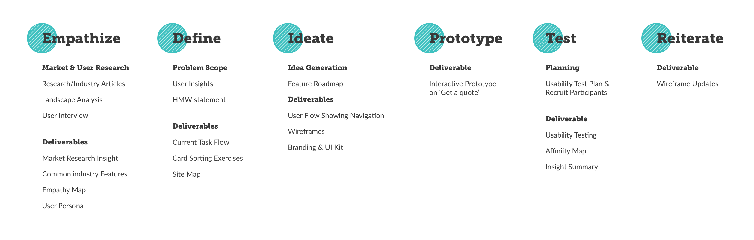
KAUS is an insurance company providing a wide range of coverage and plans for over 30 years. They have been working through regional agents, selling the policies to them instead of directly to customers. Kaus hopes to develop their online market to reach younger millennials  to make the best choice and to be able to buy insurance online.

Project Goal

To design a seamless flow for user to get a quote for their desired insurance plan online with KAUS.

Duration

3 Weeks

Role

UX Researcher and Designer

Tool

Figma, OptimalSort

1) Empathize

Conducting research on two areas – the online insurance market, and user's attitude and behavior – can help understand current market practices and how users feel, think and act regarding insurance purchase. The insight can inform the ideation phase in a later stage.
Research Scope
a) Market Research
  • How does insurance industry cater to the young market segment?
  • What are the business practices of insurance industry moving towards digital?
b) Primary Research About Users
  • What motivates users in choosing among insurance plan?
  • What are the painpoints of users when they buy insurance?
  • What their current process of getting insurance is?
a) Market Research Findings
Low Insurance Literacy
56% were not at all or slightly confident in understanding the plans;
32.3% were moderately confident.
(Win the Journey - CHUBB)
Learning from Social Media
59% information on product and services including:
Limited Time
35% buy insurance online to save time
(Win the Journey - CHUBB)
Agent Should Know
80% indicated that agents and brokers should prioritize getting adequate insurance policies over getting the lowest price;
When users looking for an agent:
  • Positive online review
  • Represent a well-known company
  • Convenient location
  • Social media engagement
  • Modern website
    (Statista:social-media-usage-by-young-insurance-agents-usa)
    (Understanding-Millennial-Insurance-Consumers-2019-Updated)
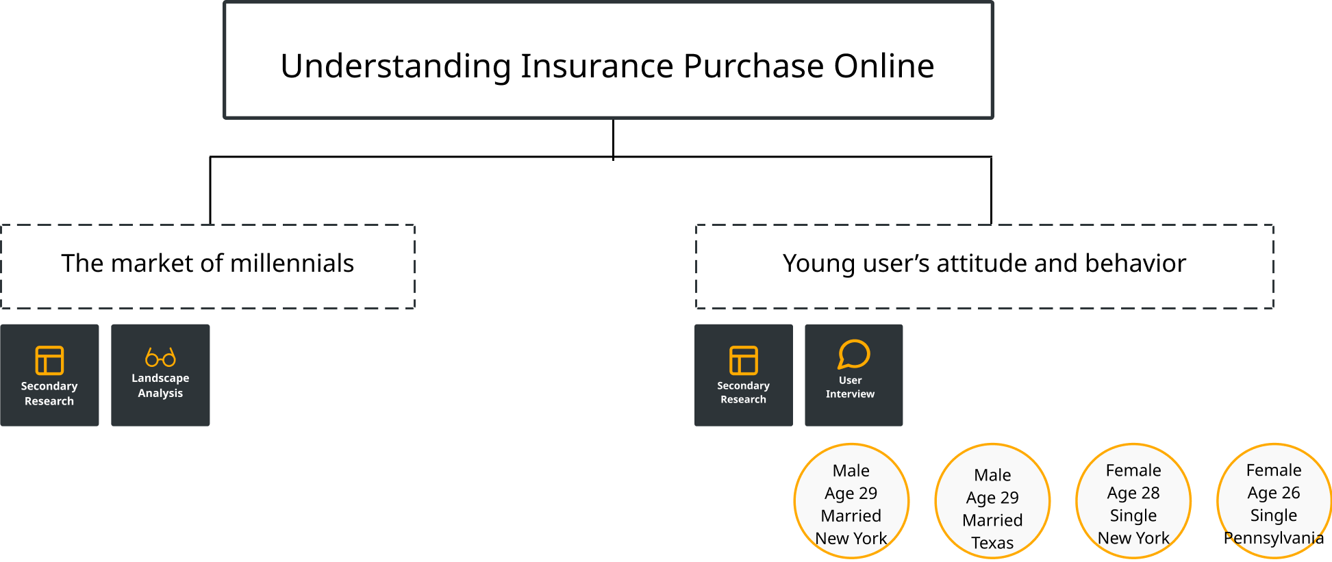
“We’re trying to get young folks to be the face of the industry, we’re doing a lot of peer to peer recruitment. We talk to companies about trying to build out their internship programs.”

- Vice President at The Institutes
Competitive Landscape Analysis
To help inform and develop the structure and content of the website based on existing insurance website
1. Main Call-to-Actions to ‘Get a quote’
2. Major user tasks for existing users on navigation bar
3. Source of customer support: phone number
4. Claim process not very accessible

b) About Our Users

User Interview

After learning the current market and understanding out target users, I drafted an Interview Agenda including interview scripts and a handful of open-ended questions for my participants to take part in user interview as my primary research.
My participants:

Empathy Map

From the user interview, two user groups were identified, which the result resonates the findings of my secondary research:

1) Buy online to save time

2) Buy through an agent to get personalized information

They were represented by the two empathy maps showing two different user needs, actions and any patterns across users.

User Archetypes

The collected thoughts were gathered and two archetypes were made to help me focus on each user group's goal, motivation, disappointments and needs. Though focusing on the four areas, I intended to create solution with user's priority in mind.

Current Task Flow

The current path of both groups of users start with the same step – searching about the insurance company online. While the users who buy with agents concerns about the information i.e. reviews, coverage and claim process, the users who buy insurance online looks for the lowest rate and the possibility of make claims online due to limited personal time.

Paintpoint:

• User tend to rely on the print material given by their agents or they mark their analysis or comparison of different insurance plans separately.

• Online buyers need to go through a similar path with all the companies to make decision, even though they think keeping the process online saves them time.
Users who choose to buy insurance with agents.
Users who choose to buy insurance themselves online.

2) Define

Key User Insight
Confidence & trust towards the company (trust)
Time consuming research process (efficiency)
Concern on the literacy of plan and policies (legibility)
Rely on print material or personal note taking method (legibility)
Time/location limitation to talk with an agent (efficiency)
The need of online account management (efficiency)
Difficult and complicated claim process (efficiency)
'Get a quote' feels long and the quote is not shown right after the process (efficiency)
Challenge
How might we provide trustworthy and efficient online insurance service to our users so that they can spend the least amount of time to look for what they need in order to finish the process?

Card Sorting

In the meantime having a set of insurance plans, a remote card sorting exercise was conducted at the same time with OptimalSort. 9 participants took part individually to help us understand how users categorize different insurance genres, and display an intuitive information architecture.

Key Findings:

Four main categories – Home and Living Property, Health & Life, Automotive, and Overseas) were easily sorted among the participants and four outliers were identified.
See card sorting result

Sitemap

To ensure a smooth navigation on the website, being able to visualize how the content is structured is important for products with multiple categories. With the findings collected in the card sorting exercise, the following sitemap focusing on the hierarchy of insurance plan is shown below.

3) Ideate

Feature Roadmap

A Feature Roadmap – including brainstormed features Must-have (P1), Nice-to-Have (P2), Delightful (P3), and Can-come-later (P4) – was made to prioritize the most important functionalities to our users, based on business needs and the user insights.
P1 features include:
1. 'Get a Quote'
2. Find an Agent
3. Online actions do not require login (i.e. Payment, Make a Claim)
4. Dropdown Navigation Menu
5. Customer Review

Task Flow

A task flow is created to visualize the navigation between each page on the website. One major thing corporated into the task flow is that user will be able to choose to send an email copy of the quote summary to themselves. The colored flow landing on KAUS website to the quote summary page will be my design focus.
The above is the happy path of user going from homepage to the quote summary page. To have an extensive understanding of each step in the flow, I also created a user flow to map out all the possible scenario based on different contexts of users.

Low-fidelity Wireframes (Responsive)

I started with sketching different versions on desktop homepages based on the UI Requirements and the task flow so as to visualize the user task (getting a quote from KAUS). The deliverables I produced before this stage have guided the presentation of visual hierarchy. A on-screen low fidelity wireframes were then created, including the ones for the responsive versions – on tablet and mobile devices.

High-fidelity Wireframes (Responsive)

Having designing KAUS brand, I created UI Kit so that the hi-fi wireframe can be established.

Overall KAUS hopes to express a brand aesthetic of:
young, trustworthy, convenient, friendly, energetic, motivated, direct, optimistic, social.

4) Prototype

View Prototype

5) Test

The prototype was given to my participants during the usability test. The goal of this test is to see the efficiency of the site navigation, how participants would perceive the brand and to see what can be improved on overall visual presentation.
Goal
• Efficiency of getting a quote (duration of getting a quote, any drop outs.)
• Utility of visual elements on the websites
• Confidence level towards KAU’s product (can the participants comprehend the content)
Participants
• 4 participants
• Participants age 18 to 30
• Who have experience in buying insurance
Task
• Get a quote for car insurance through KAUS desktop website
See Usability Test Plan
Usability Test Result
Brand Attribute
Refreshing look of the website and think the company is matured and professional
• The structure of content is clear and easy to follow. Overall organization is clean and simplistic.
• The credibility of an insurance company depends on the variety of the insurance provided.
• The more variety the company offers, the more trustworthy they are.
Visual Presentation
Needs to improve visual cue on elements can be clicked on: ‘Our section’ on homepage and the cards on ‘Hear from our customers’
• The color theme is approachable compared with high saturated color used by other company.
Unclear message of the content in “Your applicable savings” on the “Quote Summary” page.
User Flow
• All participants found the navigation is easy and straightforward.
• All participants predicted similarly of what would happen after the last page of the prototype: intention to buy the insurance online and/or talk to an agent.

6) Reiterate

I made revisions based on the major user's feedback in my usability test. And the followings are five major changes between the first iteration and the revision.
Insurance Product Cards
Original
• Users could not be sure if the card view is clickable.
Revision
•  Visual cues including text link “See all options” and a hover stage effect are added.
Customer Review
Original
• Reviews do not seem authentic. They could be picked by the company before showing on the website.
Revision
• A better option would be considering to use third party reviews to give users more confident in KAUS products. e.g. Google Review and
Quote Summary Page
Original
• Users did not notice the section 'email a copy of quote summary' until they got asked about it after the usability test.
Revision
• Users find emailing copy useful and wish to see the section earlier because there is a tendency of not scrolling down if the price does not appeal them.
• The heading of the section is enlarged so as to make the call to action obvious.
Quote Summary Page
Original
• This section shows briefly discount options users can choose from, but the content is not comprehensible to them, including the heading. They hope to see a small description for each option.
Revision
• The heading is changed to shorter and clearer.
• A small description is added to make it easier to understand for the users.
First Page of 'Get a Quote' – Account Login/Sign Up
Original
• User flow of ‘Get a quote’ process starts with  login/Sign up page, where one participant found it unnecessary, and one participant in usability test did not feel comfortable to sign up first before getting a quote.

Revision
• The sign in/sign up step is removed to engage with the users throughout the process.

Next Steps

Extensive Research on Using Illustration and Photo
Users seem to be fine with a mix of use of illustration and images, but in order to keep the visual consistency, an extensive research on using both can be conducted.
Design Email Copy of Quote Summary
As one important piece to decide on the insurance purchase, a readable email copy should be informative with a clear call-to-action.
Identify Any Difference on Buying Different Products
The current findings for getting car insurance can set base or reference for other insurance products, but more research should be done to identify differences on user flows.

Reflection

Responsive Website Testing
When it comes to usability testing for a website, it almost feels natural to test on teh desktop version. Having done research on the users knowing that they are heavily mobile and social media user, it would be even more appropriate to do the testing on mobile device versions. User interaction would turn out differently, for example, because I cannot use hover stage to tell clickability of certain elements.
Familiarity with the Industry
Insurance is not an industry that I am familiar with, it could take a long time on just to know about what the companies do. As a designer, always being aware and curious of different industries is very beneficial to my work.
The Importance of Documentation & Presentation
Through breaking down the research and design tasks, I had the chance to develop my skills on organizing and summarizing findings and insights. The documentation serves an important role for me to get back to what I did without any doubt. I also learned to document that is easy to understand for everyone, helping my articulation of my thought process.