Home cooking, grab-and-go, heat-and-eat are the new lasting food-at-home trend since the pandemic. Customers tend to prepare or have meals at home with healthier food choices than before. Customers are looking for tasty, convenient meals that bring positive health benefits.
In this project, considering the changes and the trend of grocery shopping behavior, an MVP for a mobile application will be created along with a case study to assist users to make informed decisions on groceries and food purchase.
UX Researcher & Designer
To identify the demographics of the users
To understand the current and future grocery shopping trends
To identify goals, needs, frustrations, and motivations of the users
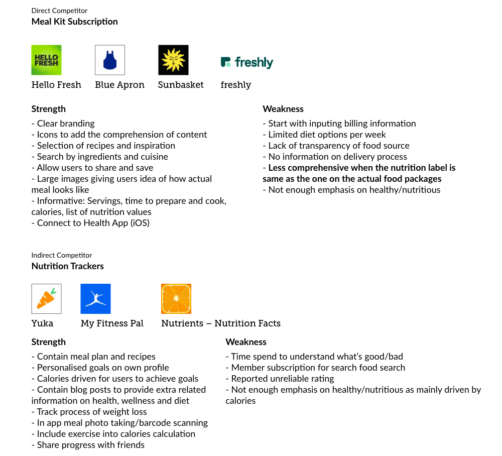
To understand competitors practices including strengths and weaknesses
Revised Nutritional Label
The process of revising the nutritional label reflected the way of how customers consume the content. For example:
Change in Grocery Industry based on Consumer Trend during COVID
Meal Prepping and Cooking Behavior
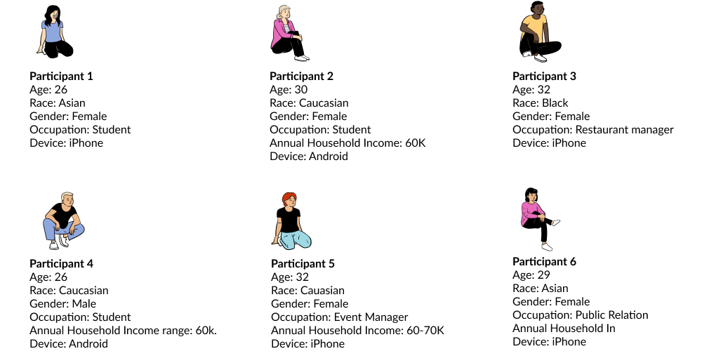
Who are the consumers?
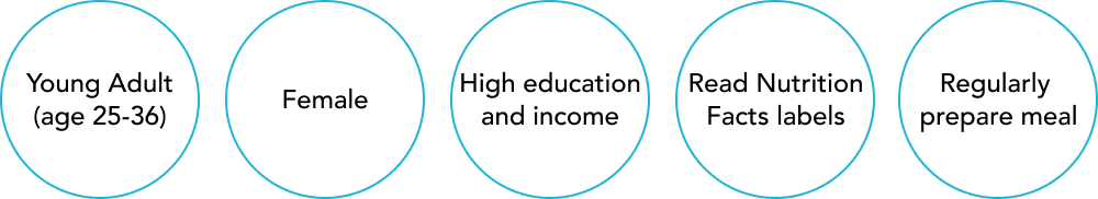
After learning more about the current trend in the grocery industry, it was more clearer to me of who are the right people to dive deep into the topic with. For that, I invited 6 participants to join my user interview sessions so that I can look for a more qualitative data as my primary research.
Affinity Map
I created an affinity map to synthesize the transcripts of the user interview. The patterns were found across the participants to help me uncover users needs and insights for later strategy and design phases.
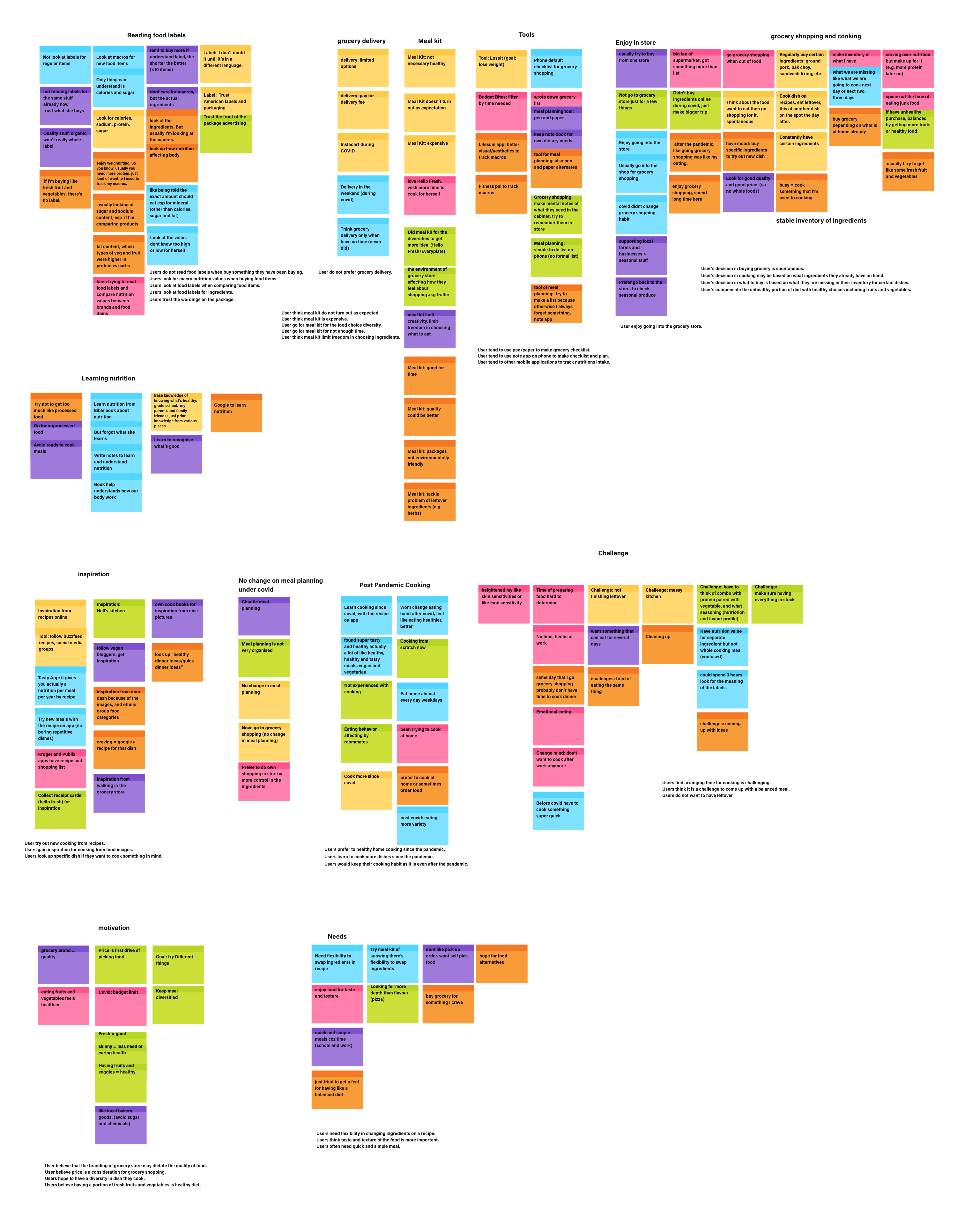
User Insights
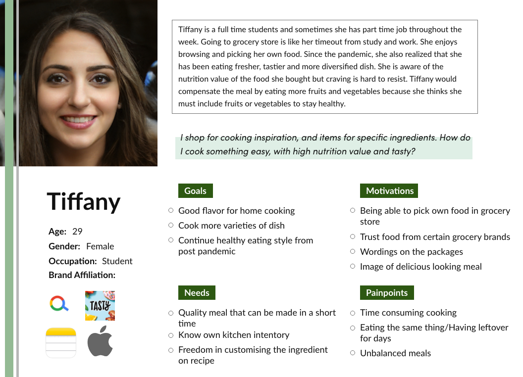
User Persona
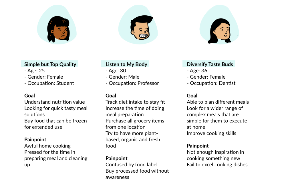
The findings from the empathy map was collected and summarized in the user persona, Kelly. It assists the design process by presenting our target user group with the essence of their goals, needs, motivation and pains.
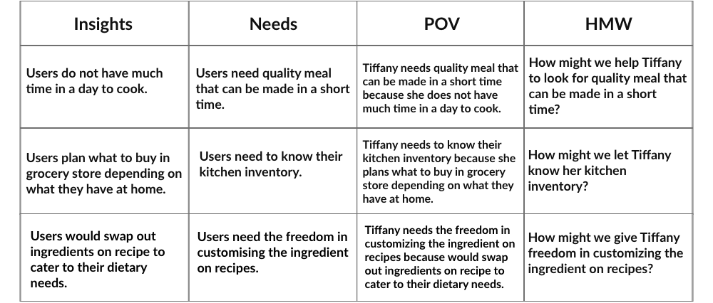
To define what problems I get to solve for our users, I framed point of view (POV) statements from our persona, Tiffany's perspectives. Each statement was derived from the user's insights listed above, and each statement helped me redirect user's point of view into How Might We (HMW) statements to see what problem I should solve for the users.
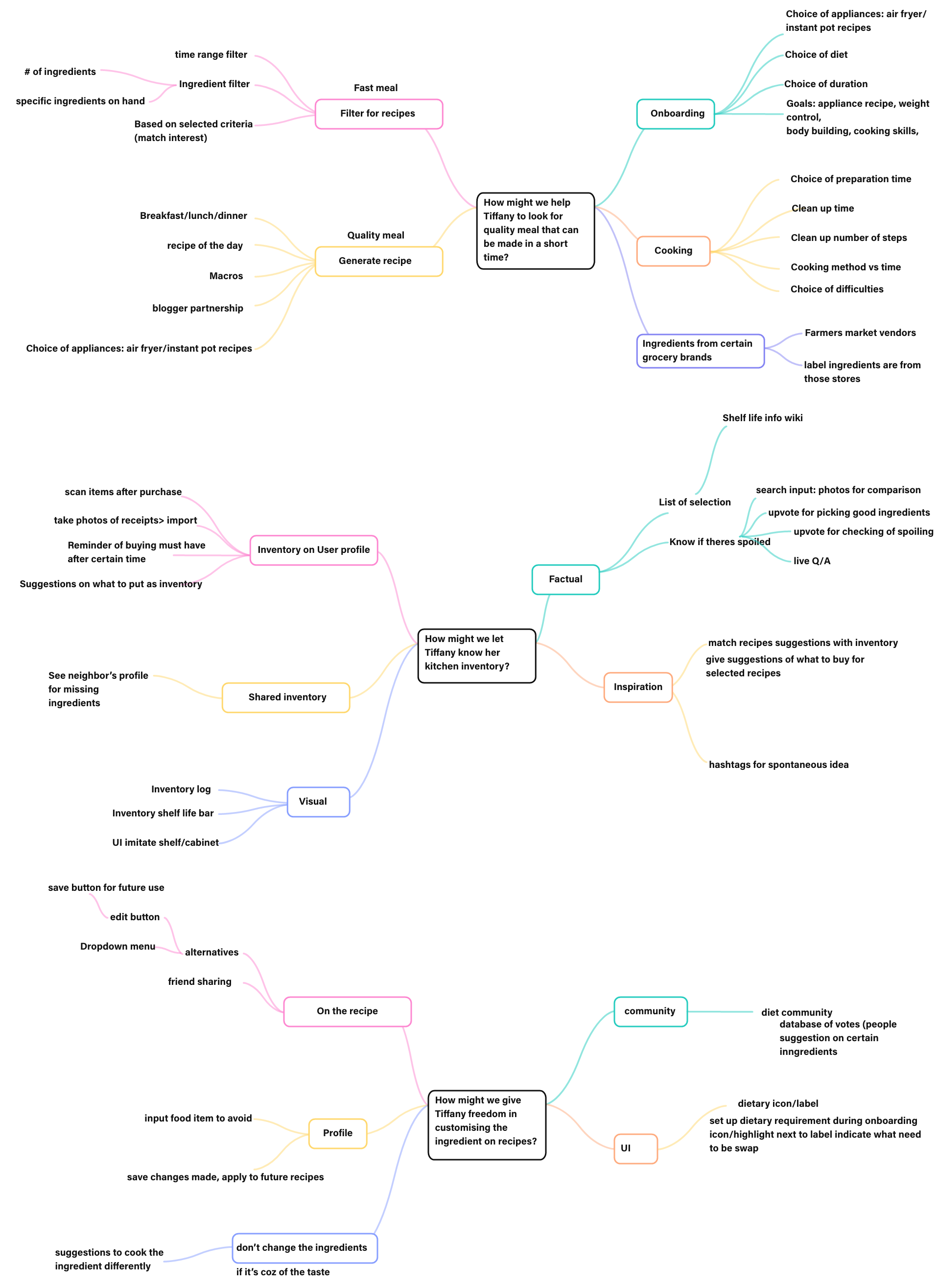
This individual exercise is initiated based on the three HMW questions concluded from the user interview. Mindmap helped bring thoughts and ideas on different topics from something general to specific and synthetically relevant.
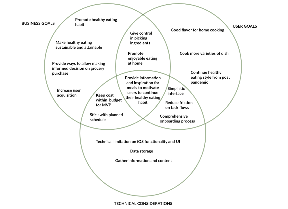
Having set the goal at the beginning of the project, it is important to see in what ways the product meet the user goals, and also what are the technical consideration behind the scene. It also gives a long term vision for the application to grow.
Overall users would like to have tasty meals with varieties and be aware of eating healthy, and at the same time the application is to provide enough information to inspire what users can cook, and to have them reviewed their meals of the day.
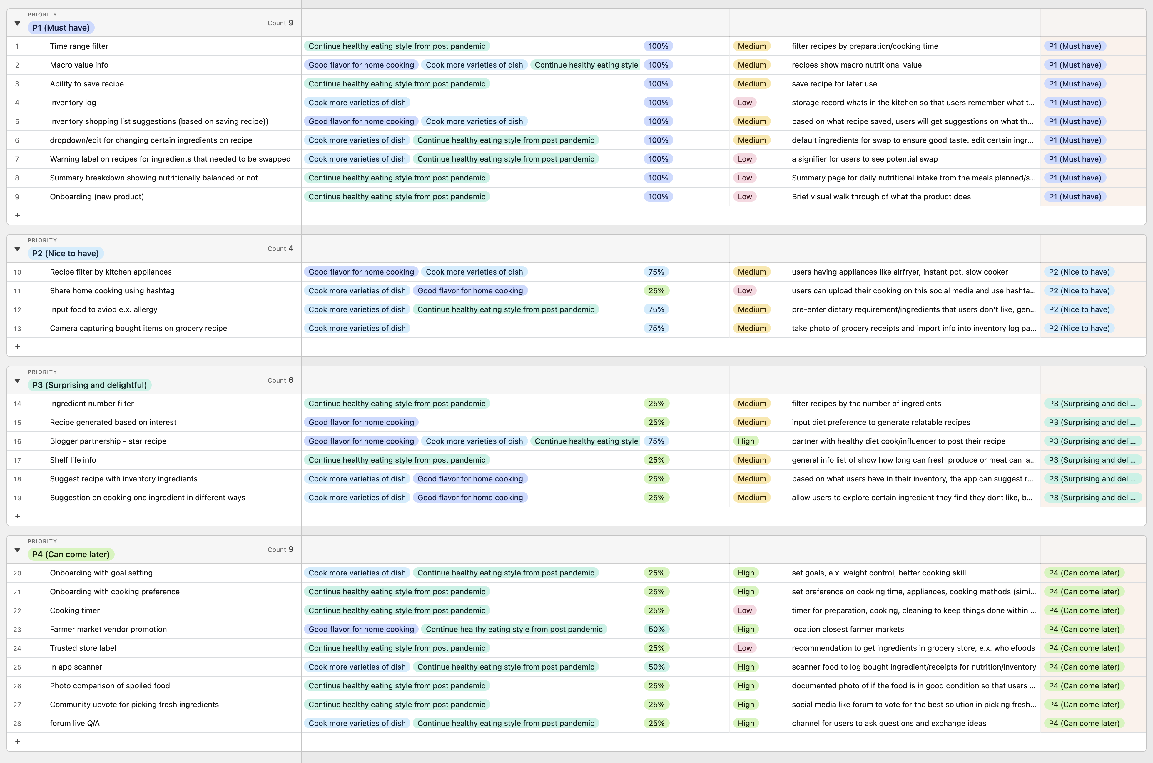
These roadmap allows me to prioritize the features I come up with during brainstorming sessions, from P1 (Must have) to P4 (Can come later). Based on the difficulties and confidence level (%) of how much the feature will allow users to achieve user goals, and as an MVP (Minimal Variable Product), I chose to work on the features on P1 section to first meet the user needs in a shorter period of time.
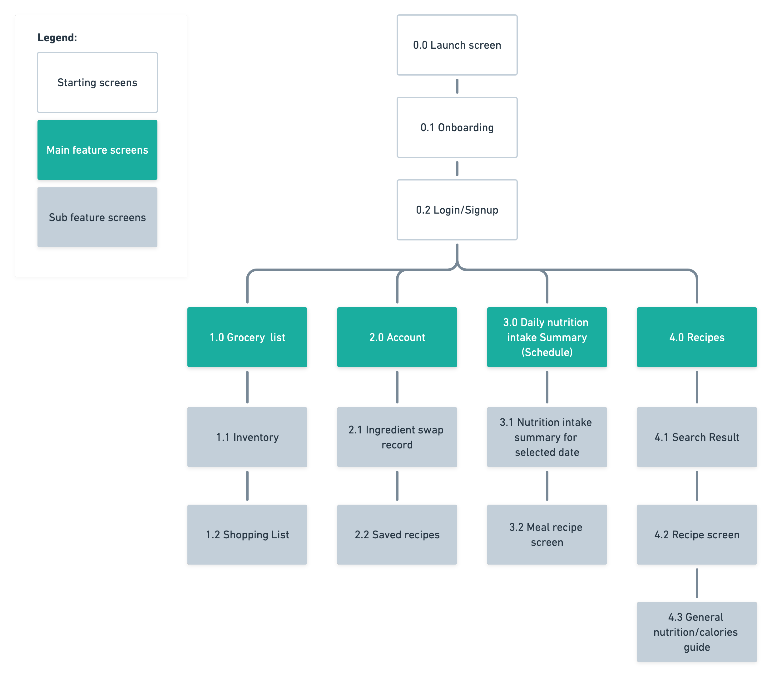
Scroll to right or click on the image for viewing complete app map:
The app map is done by visualizing the main features on the navigation menu for an iOS mobile application. With the P1 features listed on the roadmap, the users would be able to start with meal planning, grocery shopping, cooking, and reviewing nutrition consumption all-in-one. The features points to the following user tasks:
Task flows were created to further solidify the steps that the users take to complete their tasks based on the structure shown in app map.
Task 1: As a user, I would like to schedule a date for the recipes I am going to use for both of my lunch and dinner.
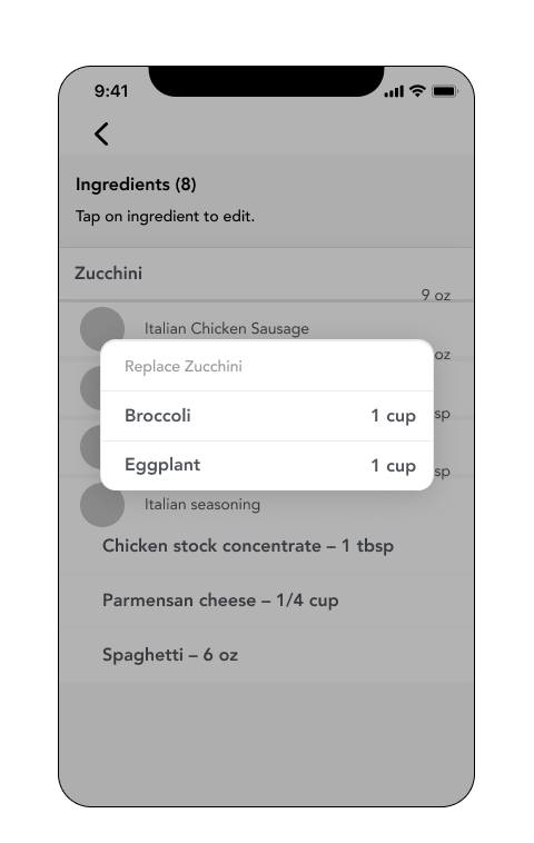
Task 2: As a user, I would like to swap some ingredients in a saved recipe to substitute for my dietary requirements or taste profile.
Task 3: As a user, I hope to export the ingredients I need from the recipe to my dedicated shopping list.
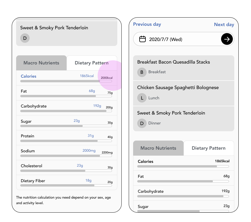
Task 4: As a user, I would like to view the daily nutrition intake summary based on the meals I schedule on the days.
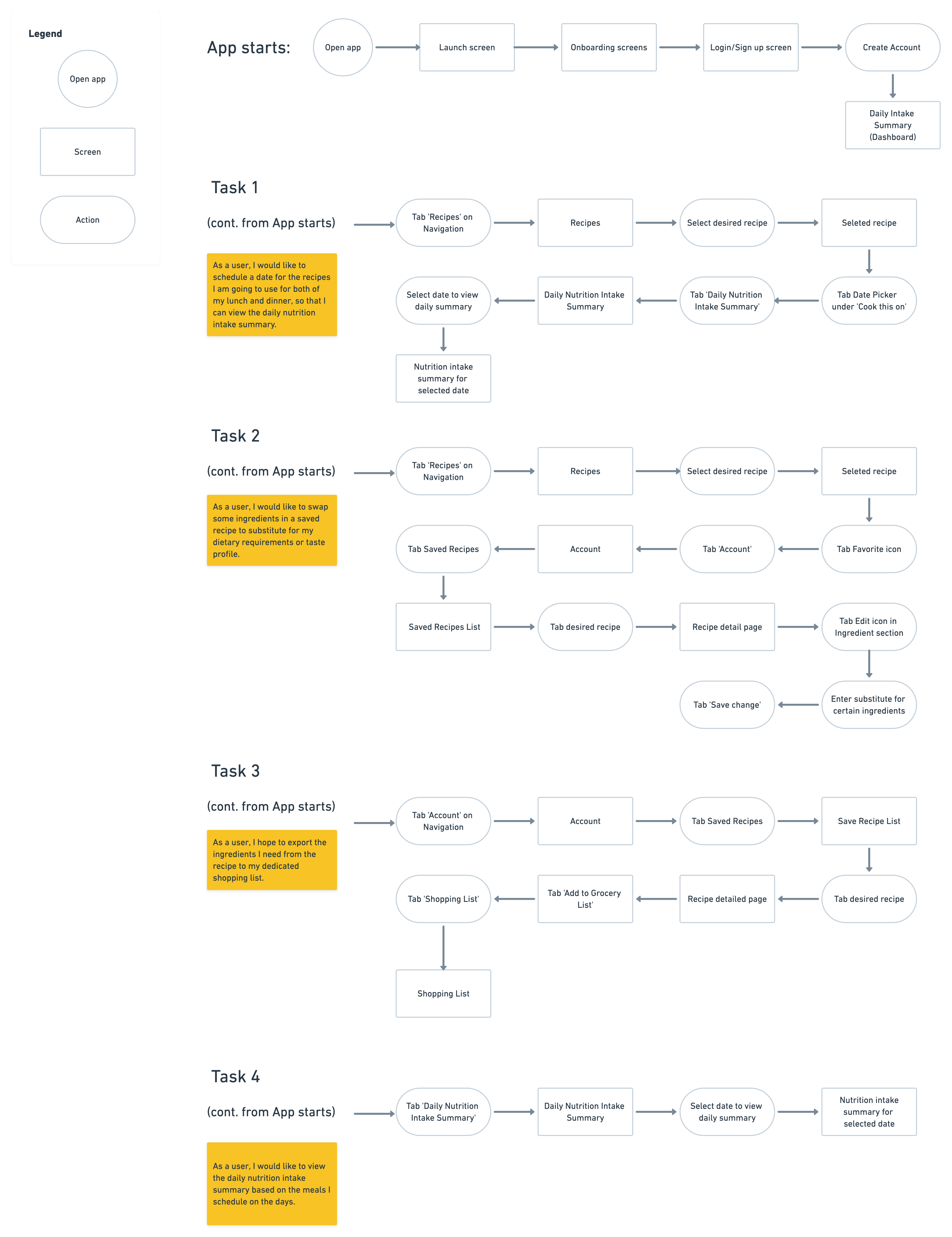
The task flows were developed into user flow. The user flow represents other possible scenarios that other users may have on their mind while completing their tasks. It is why there are decision making trees including in the user flow. See user flow.
The app map, task flow and user flow provide enough structure and content for me to further work on the design of each mobile screen. A UI requirement document was made to list out the required elements on the screens for user to see and interact in order to complete their tasks.
See UI requirement.
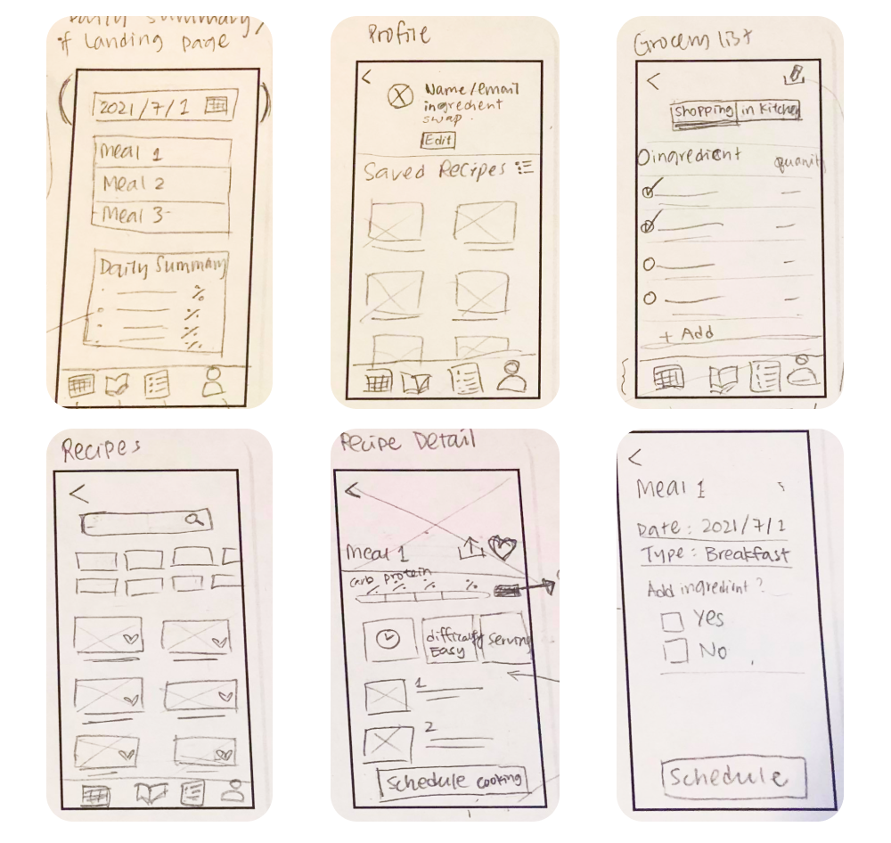
Low Fidelity Wireframes (Sketches)
Using user flow and UI requirements as the guide, the elements are come together and sketched on paper as shown below, which set a start for me to digitalize the design.
Mid-fidelity Wireframes
In order to perform usability testing to validate the design, the sketches and more screens involved in the user flow were further thought through to develop into mid-fidelity wireframe and prototype.
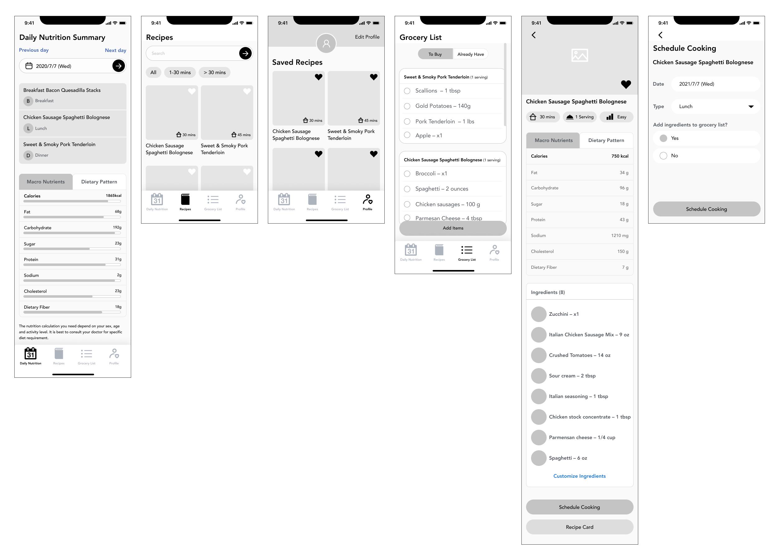
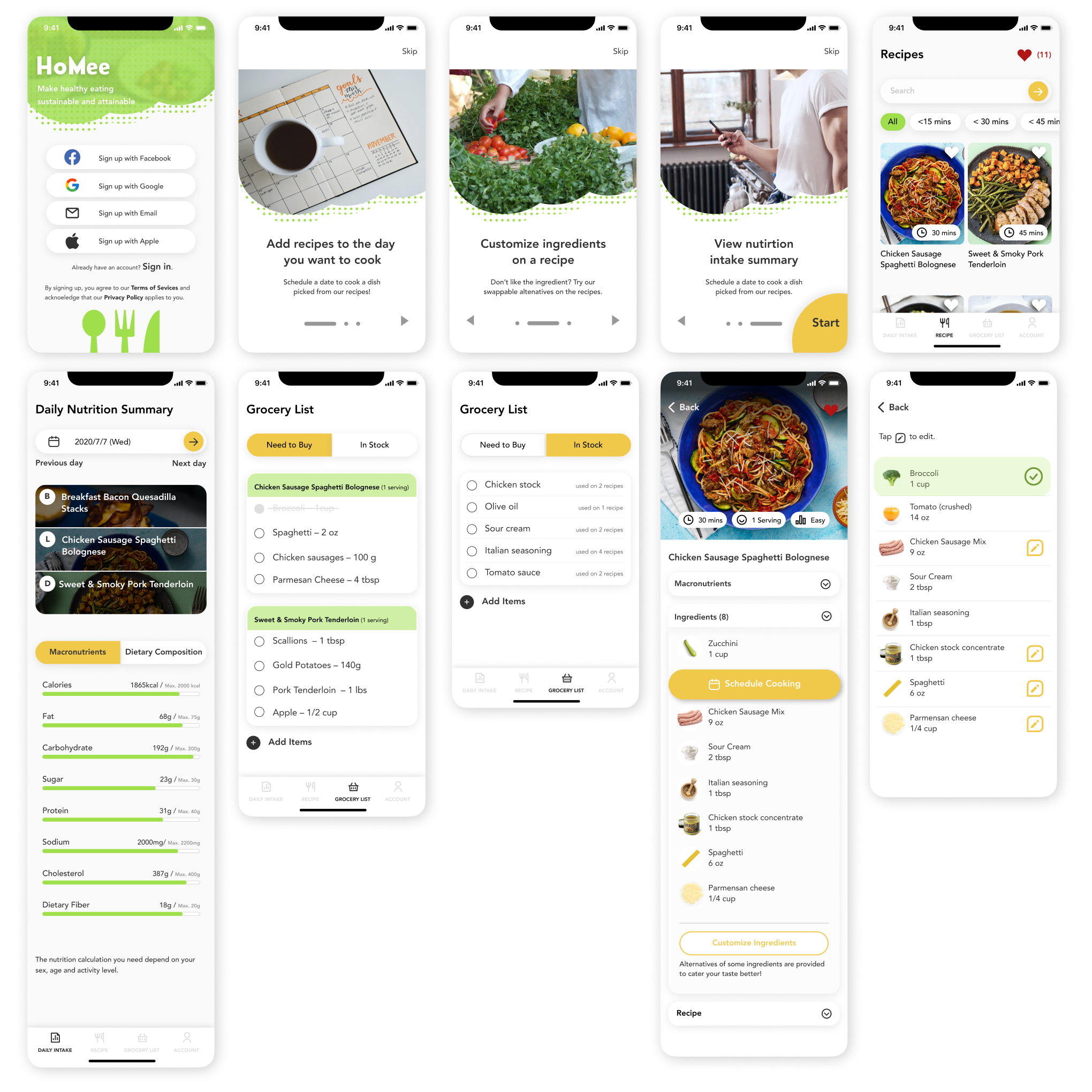
 View Prototype
Objectives
Participants
Error-free Rate (97%)
User insights were noted through grouping the notes gathered from usability test sessions.
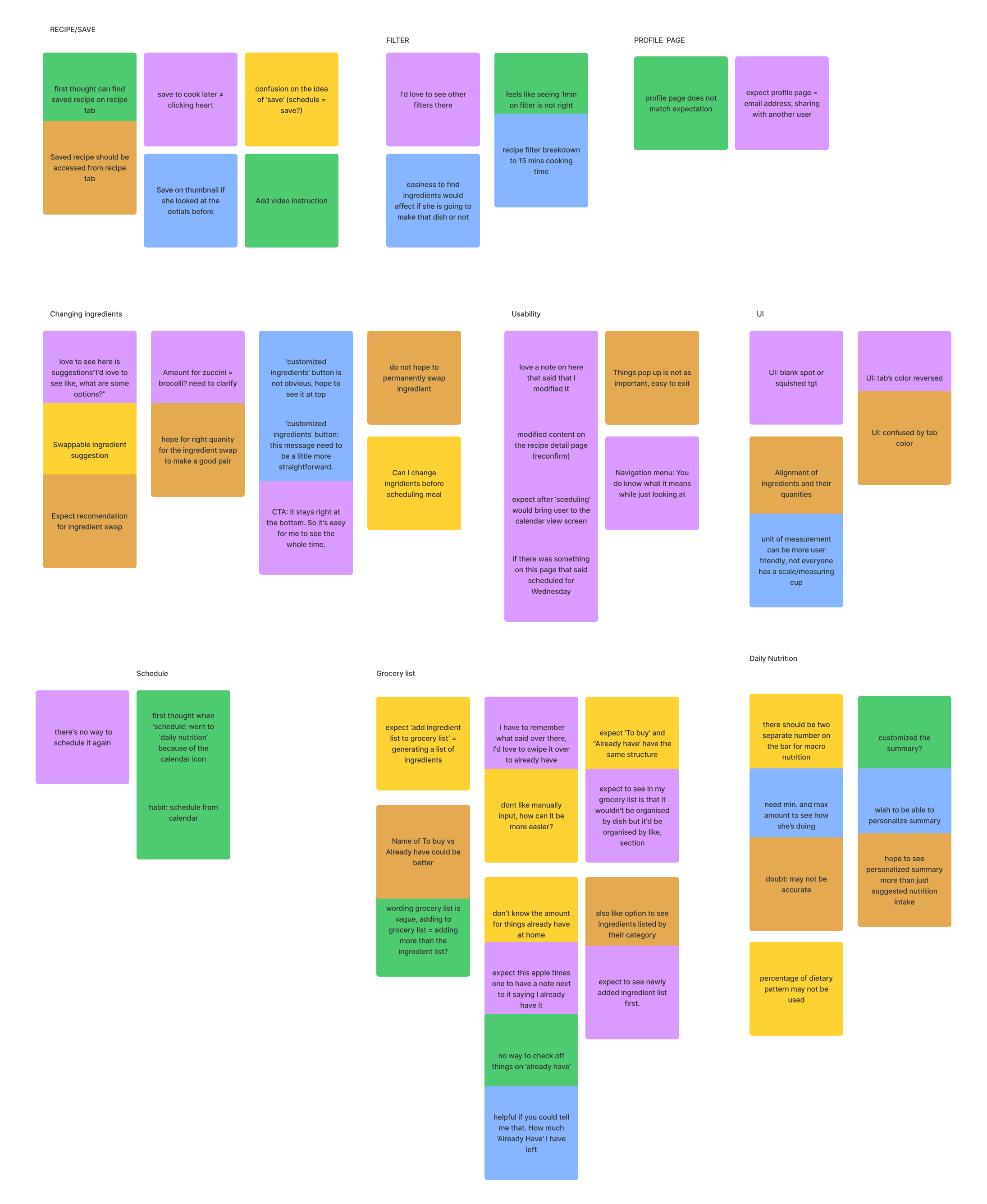
Recommendations & Priority Matrix
Recommendations were then decided to improve each user insight for later reiteration before making it into high fidelity wireframes and prototype.
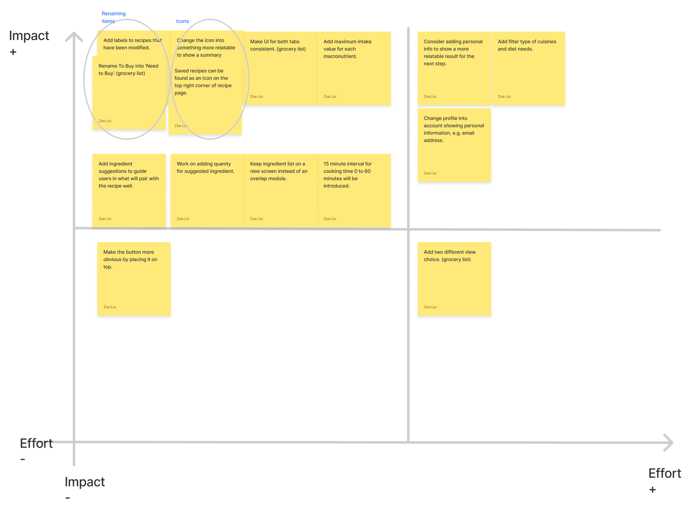
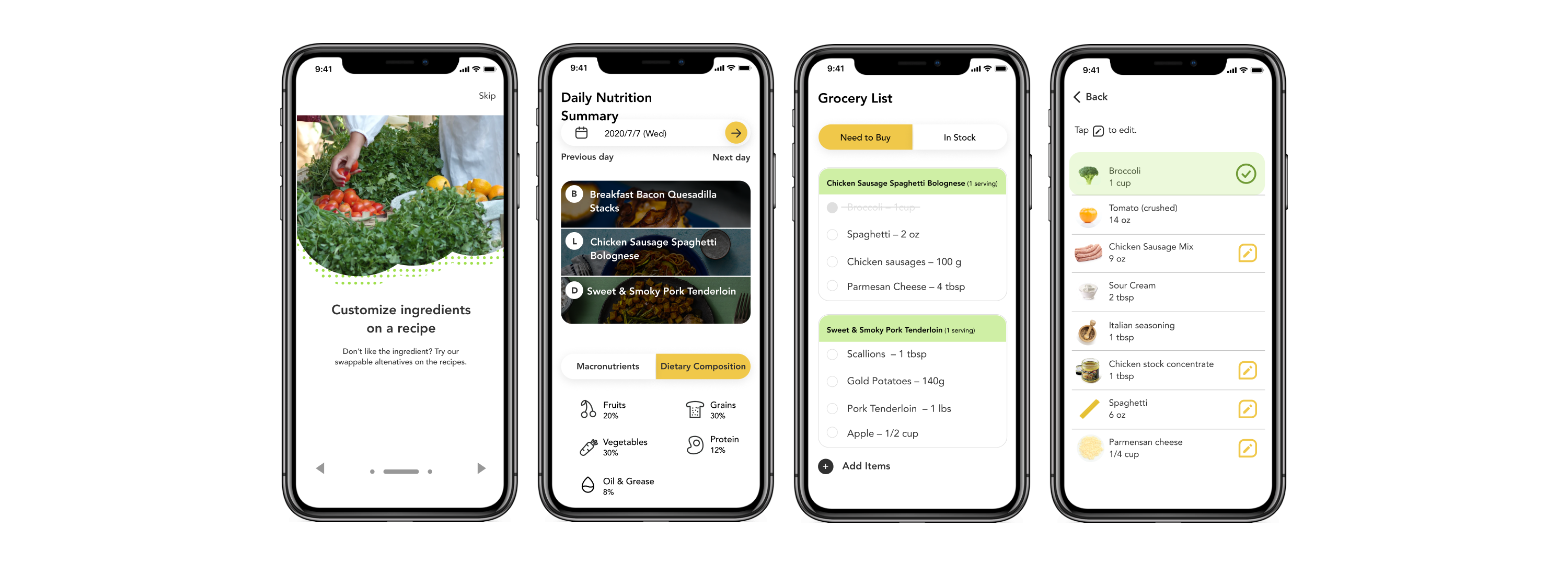
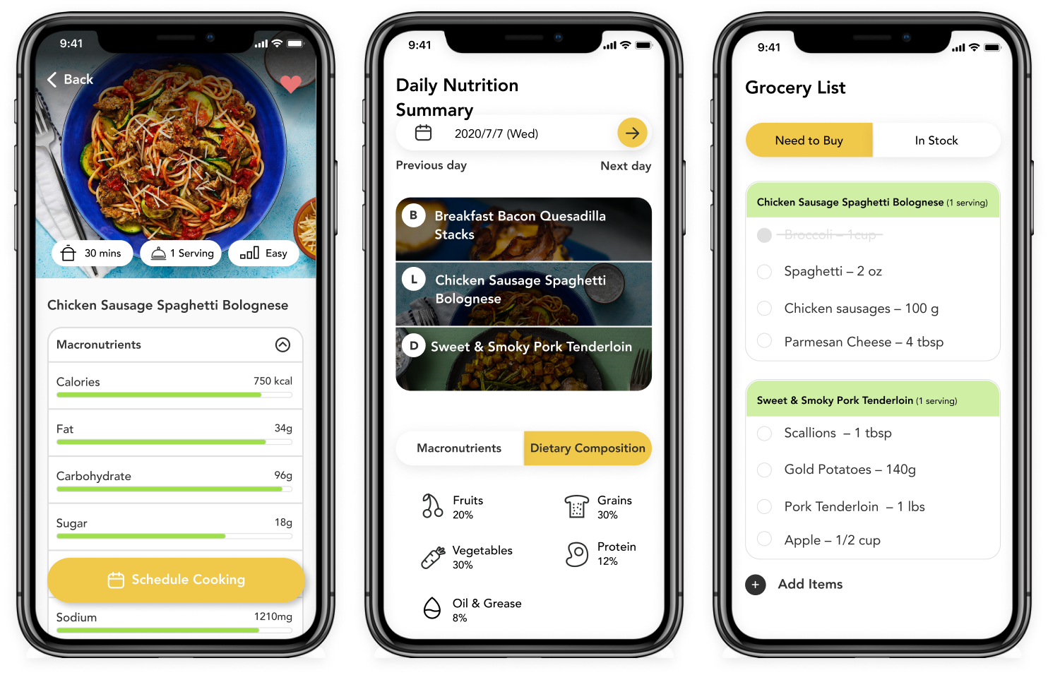
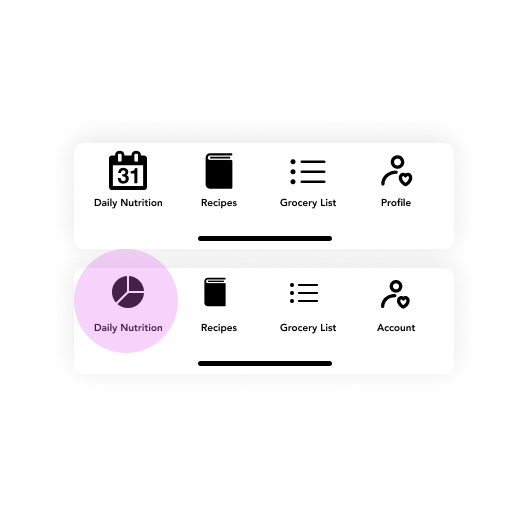
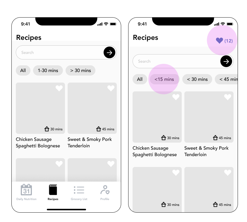
Here are some highlights of the changes I have made on the wireframes based on the recommendations.
To start making the wireframes into high fidelity version, I started with listing out the brand attributes expressed by the organization and participants in the interview, and made a moodboard and to define the visual direction for the brand and design. From there, I developed a UI Kit specifically for guiding me while I was making the hi-fi wireframes. UI kit consists of reusable elements which helps the pages stay consistent, and facilitate collaboration work in the future.
Brand attribute:
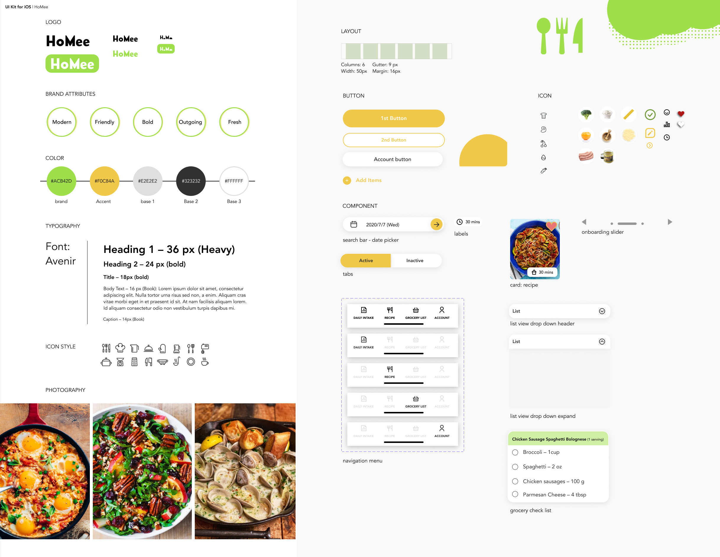
The style guide and UI kit provided me a clear direction of the look and feel of the application. At the same time, the design is going to be consistent throughout the application and it is going to be efficient when it grows.
This project is only enough to filfill users needs and goals. There are still so many areas to improve on:
View Other Case Studies