82% travelers go for a trip to relax/reduce stress. While airlines attempt to deal with the situation by coming up with different services, there are still problems that arise every day. Anxiety, not prepare for landing in a new city, etc. The continuing flight disruption is causing devastating harm to American Airlines and its customers, employees and brand. Closer to the bottom of the list is American Airlines and other budget airlines, with each carrier receiving more than 2 complaints per 100,000 flyers.
With the problems coming with a tight connection, how to make their passengers’ trip easier?
To seamlessly add features into the current iOS mobile application.
UX Researcher & Designer
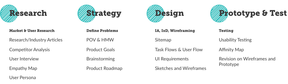
The current users behavior/tasks
The functionalities and the usability of the existing mobile application
The in-person and online experience of users
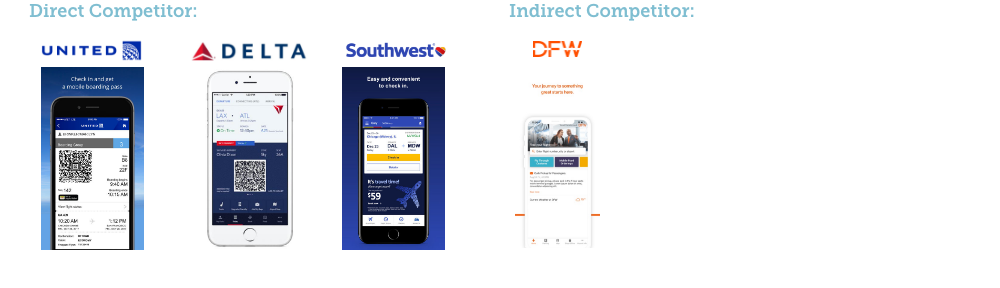
The current practice of the direct and indirect competitors
Mobile Application Usage on Travel
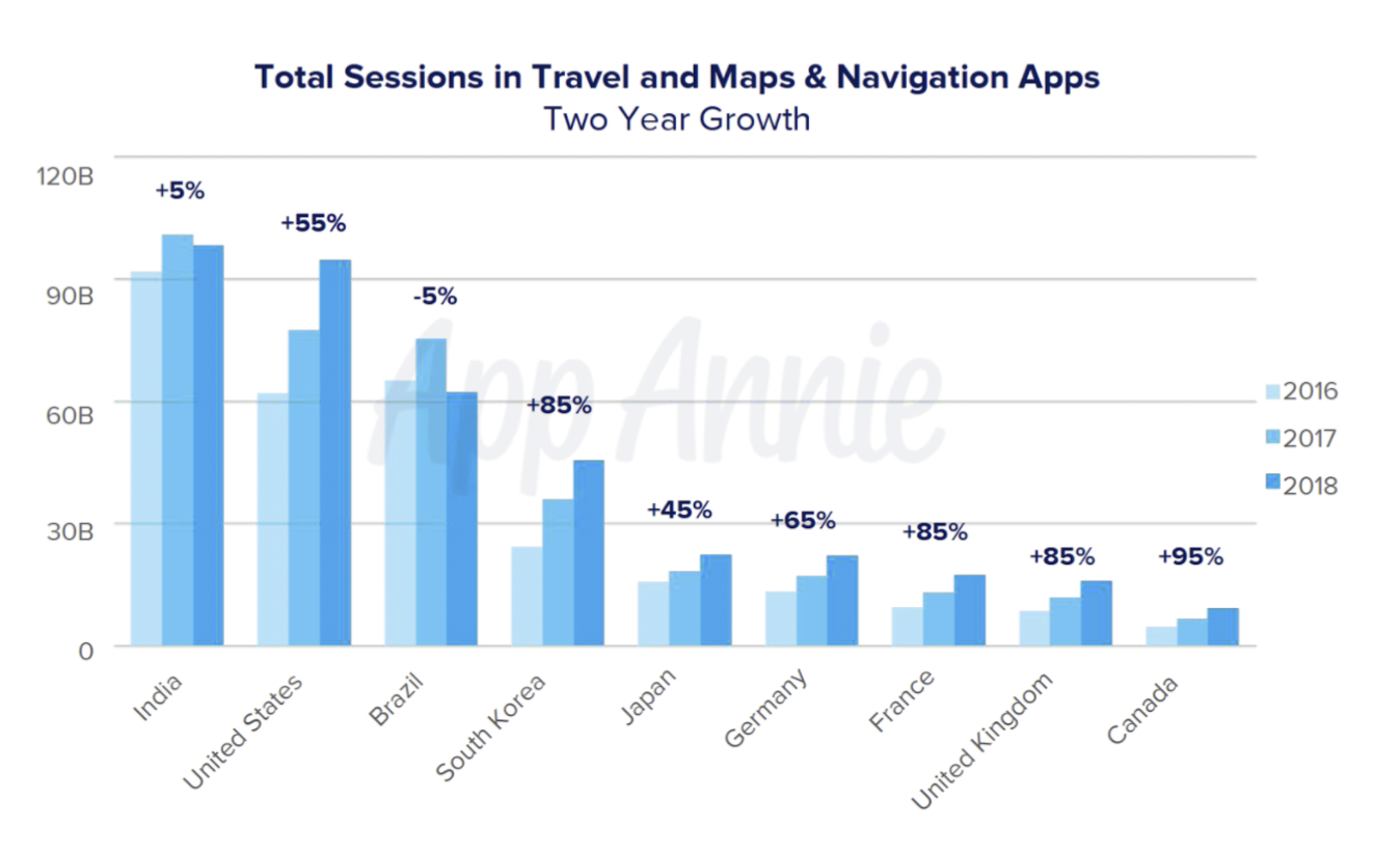
Missed Connections Conditions
Demographics
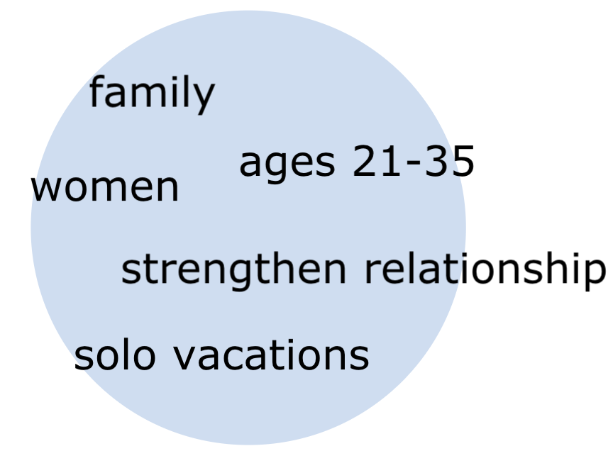
Reason for travel
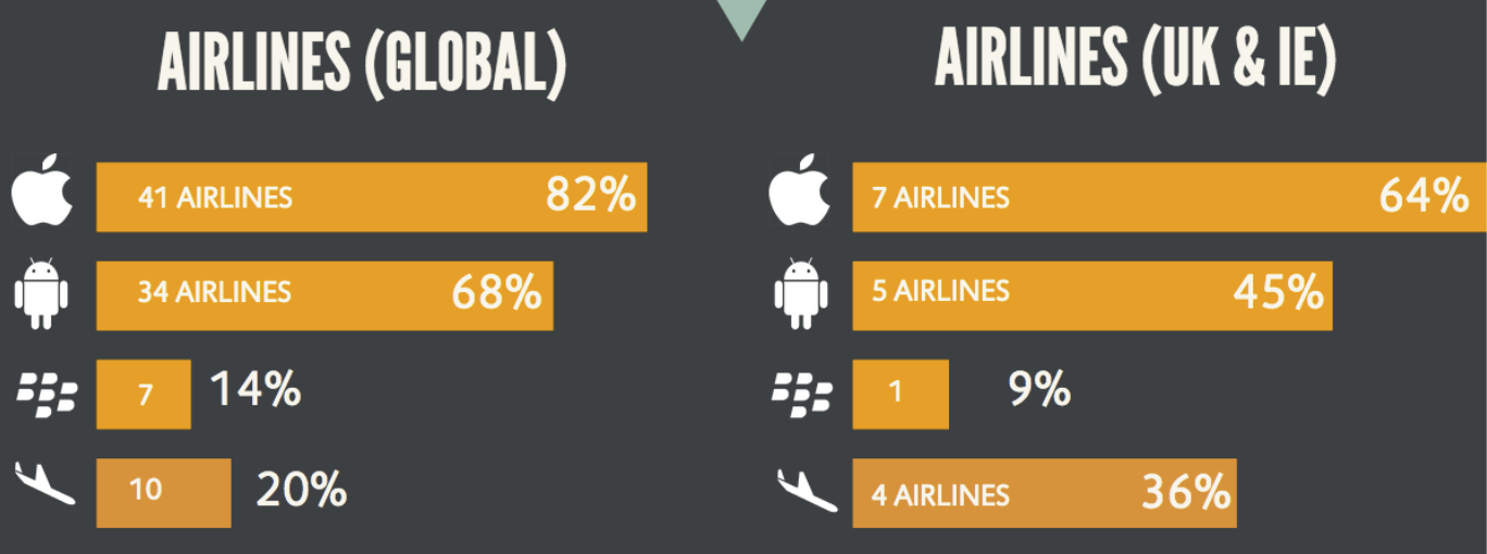
A majority of travelers are using Apple devices.
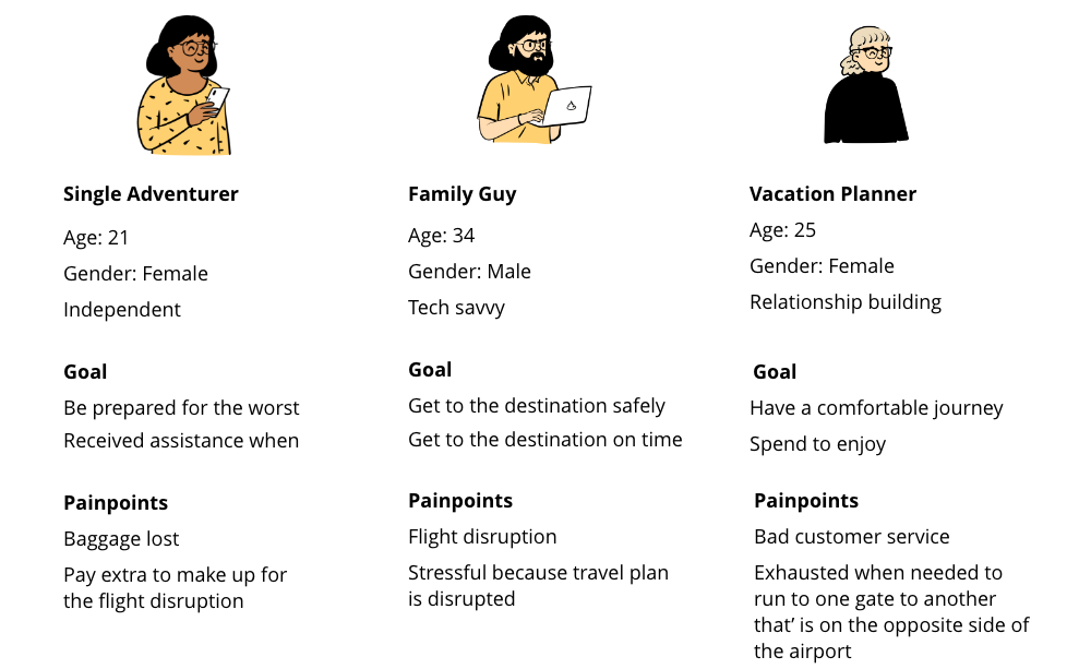
The above market research findings helped me generate some assumptions about the target users, as shown as the following provisional personas. It later on also guided me in the participant screening in my user interview (Primary research).
The followings are identified as the major common advantages of the mobile application:
1. Clear navigation menu for user tasks from booking a flight to boarding
2. Secondary menu for more tasks and information
3. Clear card designs for separating different type of information
4. Consistent branding throughout all screens
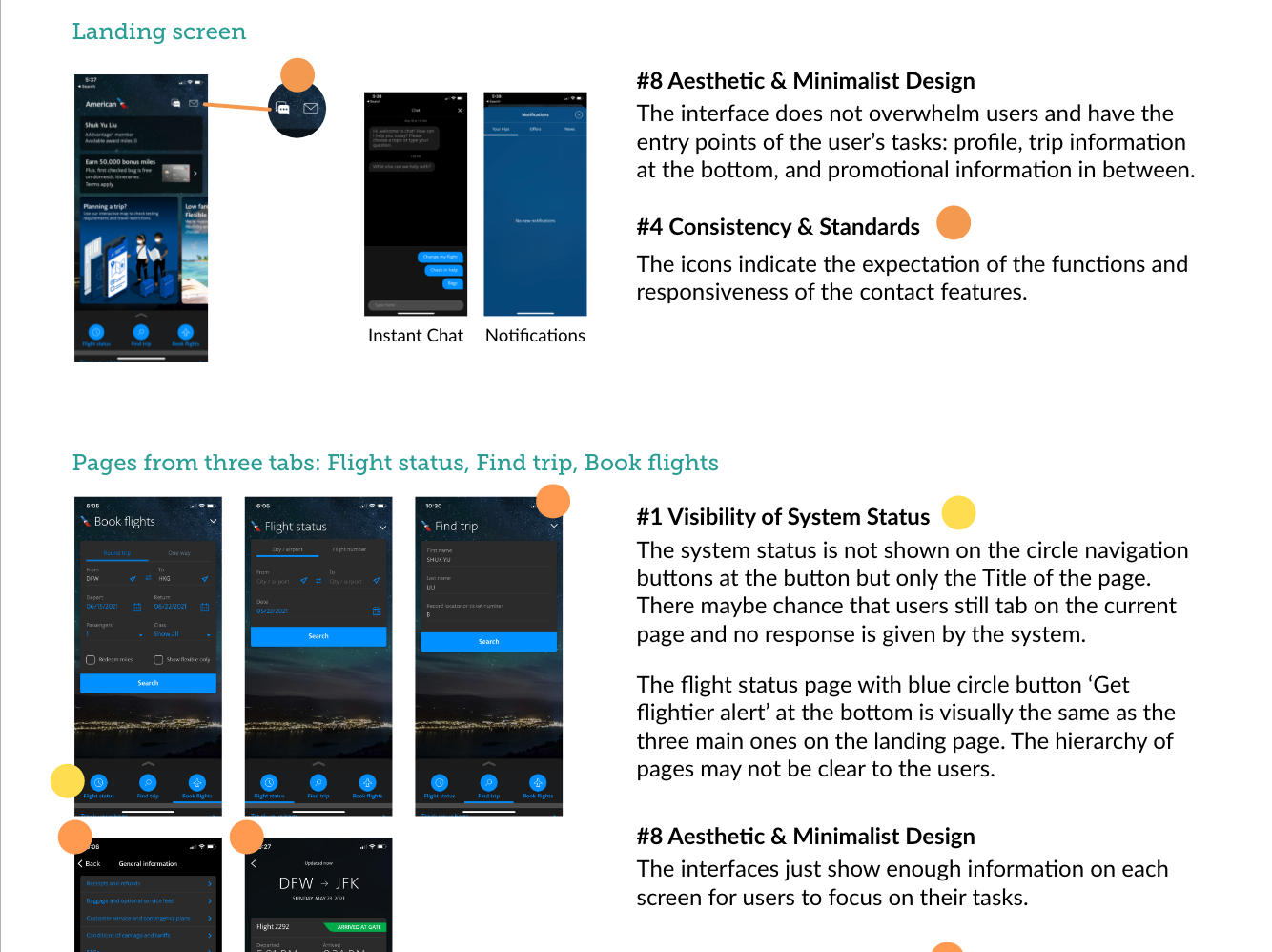
A heuristic Evaluation on the current American Airlines mobile application was done to get myself more familiar with the product and to differentiate the usability issue from any other issues that would come with the new added features.
See Heuristic Evaluation
With the provisional persona I was able to screen five participants within the time constraints and conducted user interviews with them:
Participant 1
Age: 34
Gender: Male
Location: Florida
Occupation: Application Developer
Participant 2
Age: 25
Gender: Female
Location: Sacramento, CA
Occupation: Student
Participant 3
Age: 25
Gender: Female
Location: Cleveland, OH
Occupation: Student
Participant 4
Age: 32
Gender: Female
Location: Atlanta, GA
Occupation: Restaurant manager
Participant 5
Age: 33
Gender: Male
Location: Los Angeles, CA
Occupation: Project Manager
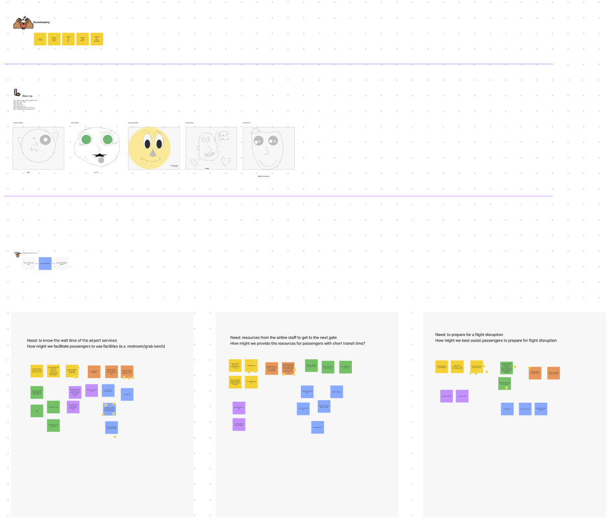
The interviews were turned into transcription and broken down into small notes so that I can create an empathy map to identify patterns and insights across the participants.
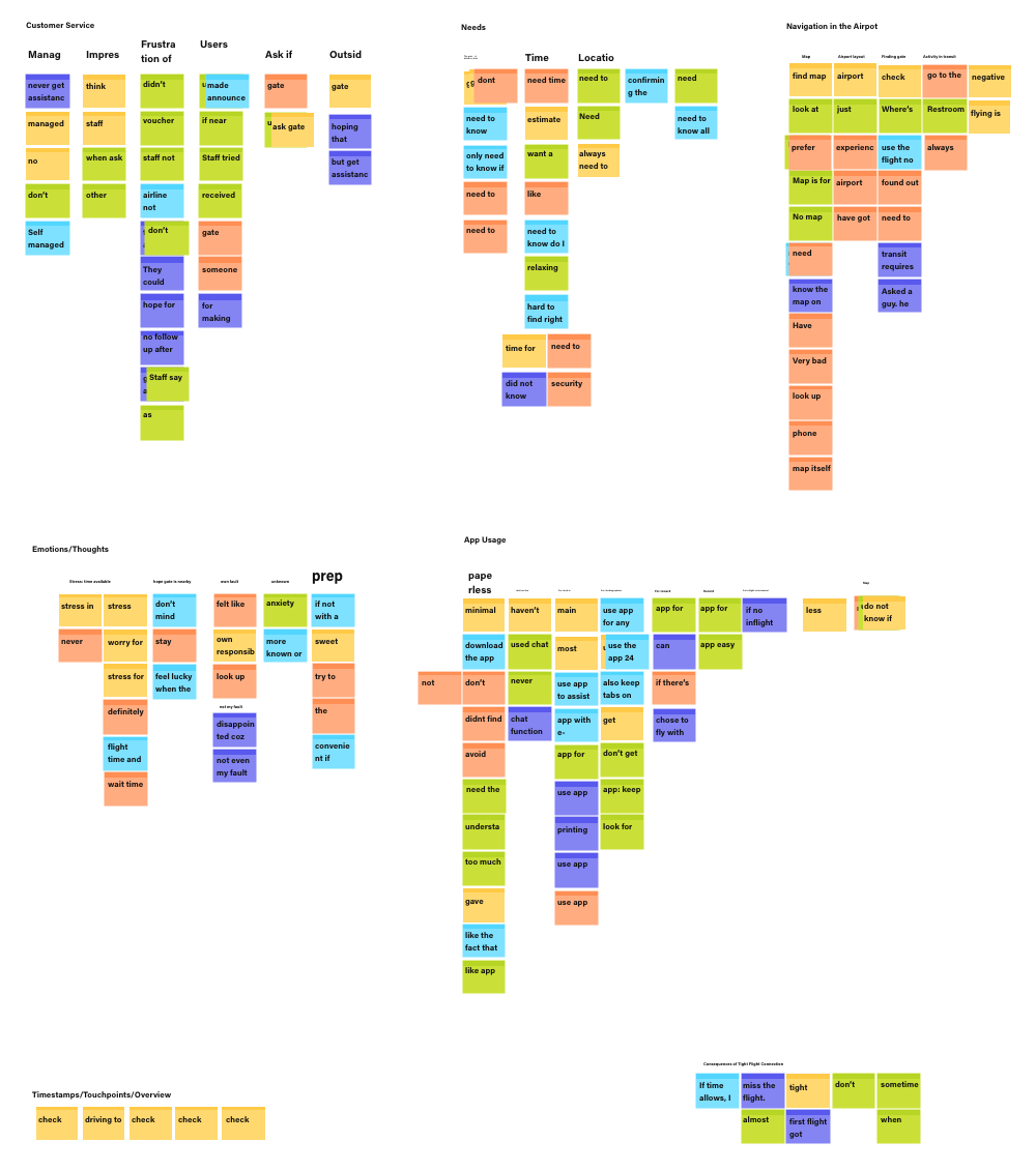
Affinity Map
User Insights
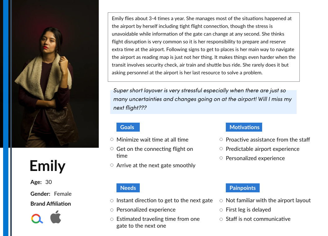
The market research findings and the user insights summarized in the user persona, Emily. Emily would be the guide of my design process to understand users in terms of their goals, needs, motivation and pains.
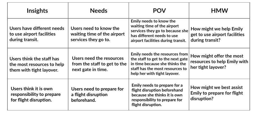
The problem statements are derived from the user insights and user needs. From there it is more clear to find out what the user needs. I combined them into point of view (POV) statements so that it is easier to see from Emily's perspective. Each statement helped me redirect user's point of view into How Might We (HMW) statements.
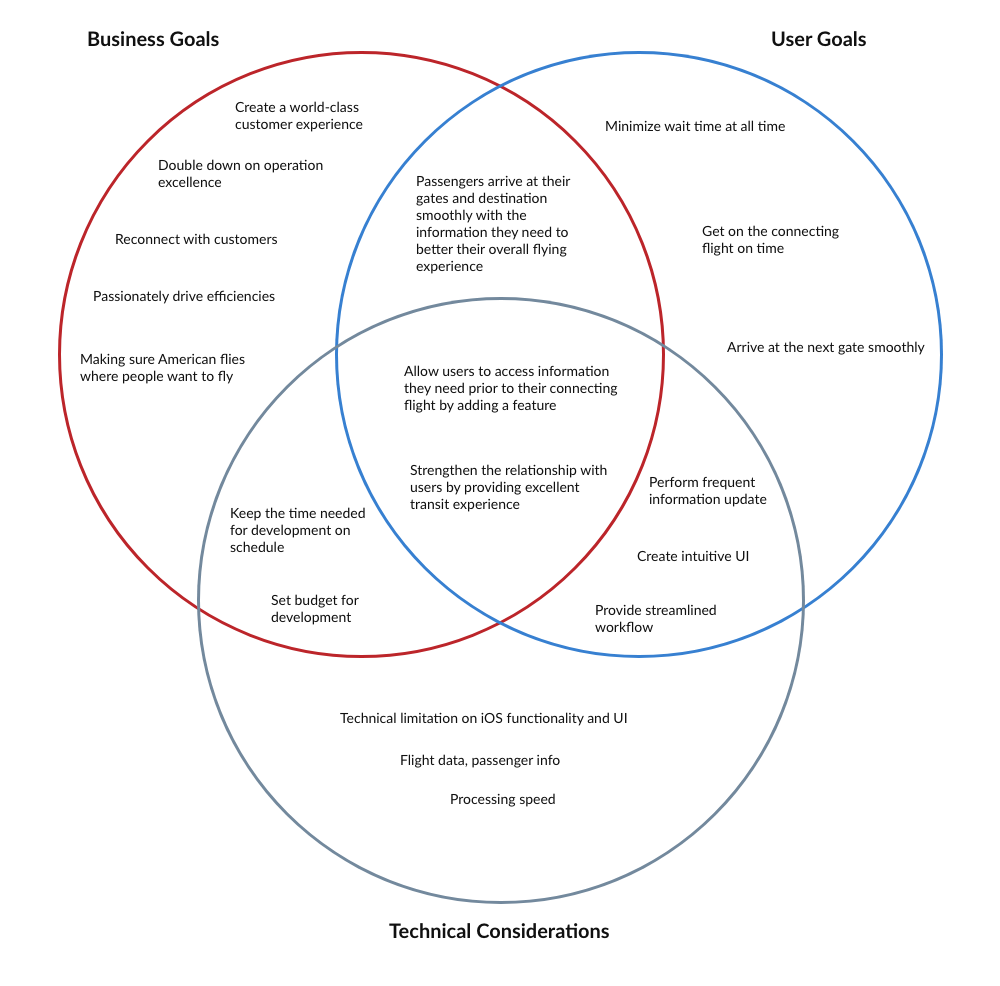
To further set the scope for my design decision, looking into what business goal aligns withe the user goals is also important to make sure the design can bring values to both business and the users. From here, it is shown that the information regarding fight connection would be what both the organization would want to provide and what the users would hope for.
An individual brainstorming exercise was done to generate ideas around the problem statements. To get more ideas from different perspectives, I have held a fun group brainstorming session with a few of my design peers. It was great to be able to listen to pros and cons for the ideas that have come up with.
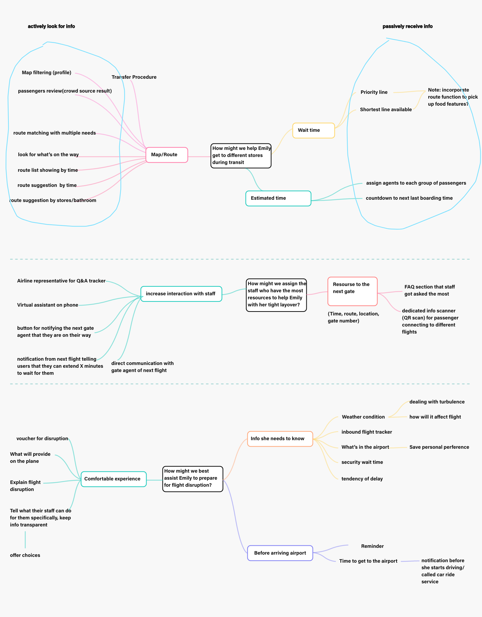
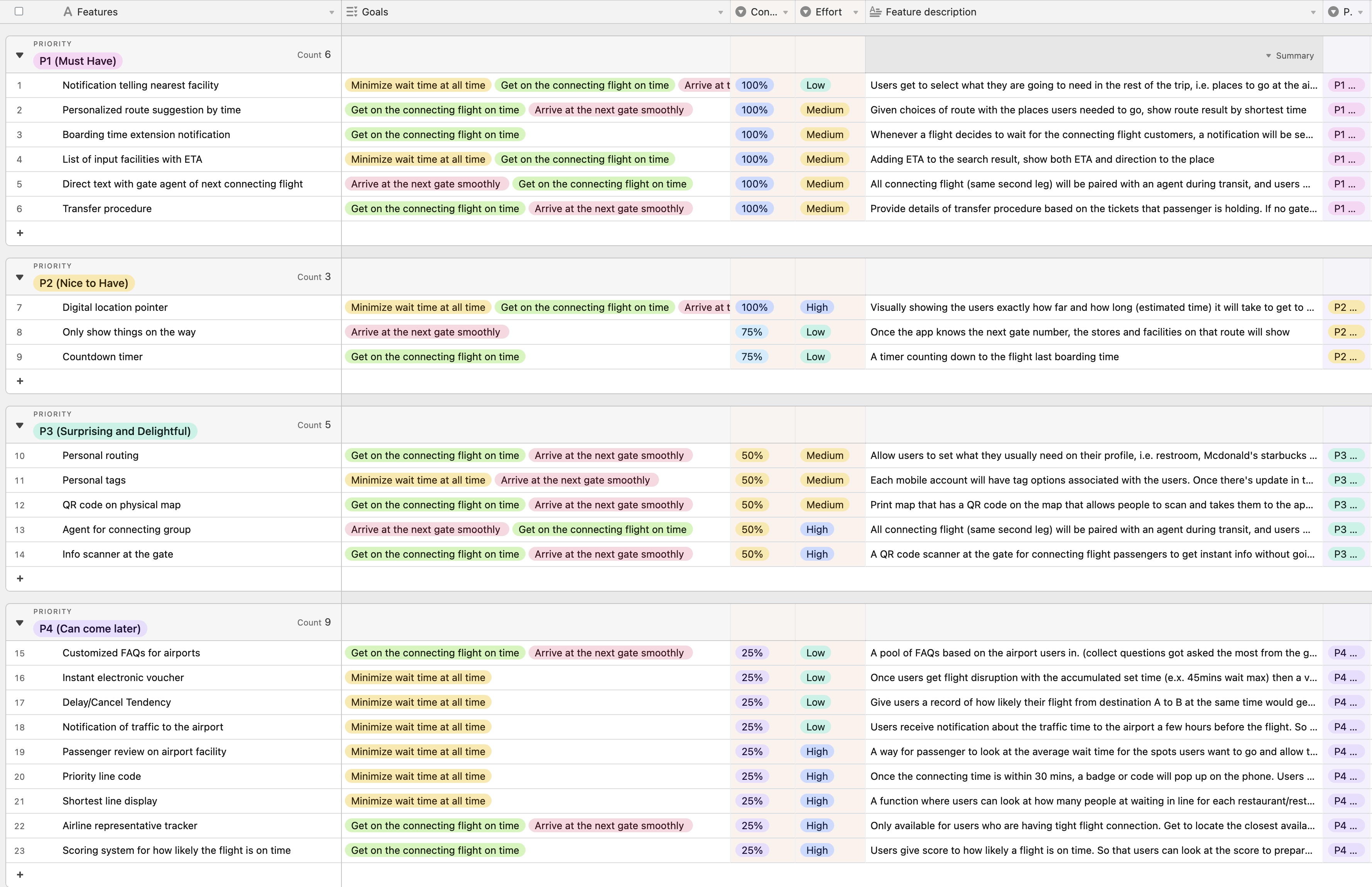
All the ideas were concluded as features and list on a product roadmap and grouped into 4 priority ranks (P1 Must Have, P2 Nice to Have, P3 Surprising and Delightful and P4 Can Come Later) according to confidence level (i.e. user goals and needs) and effort needed (i.e. technical difficulties and logistics).
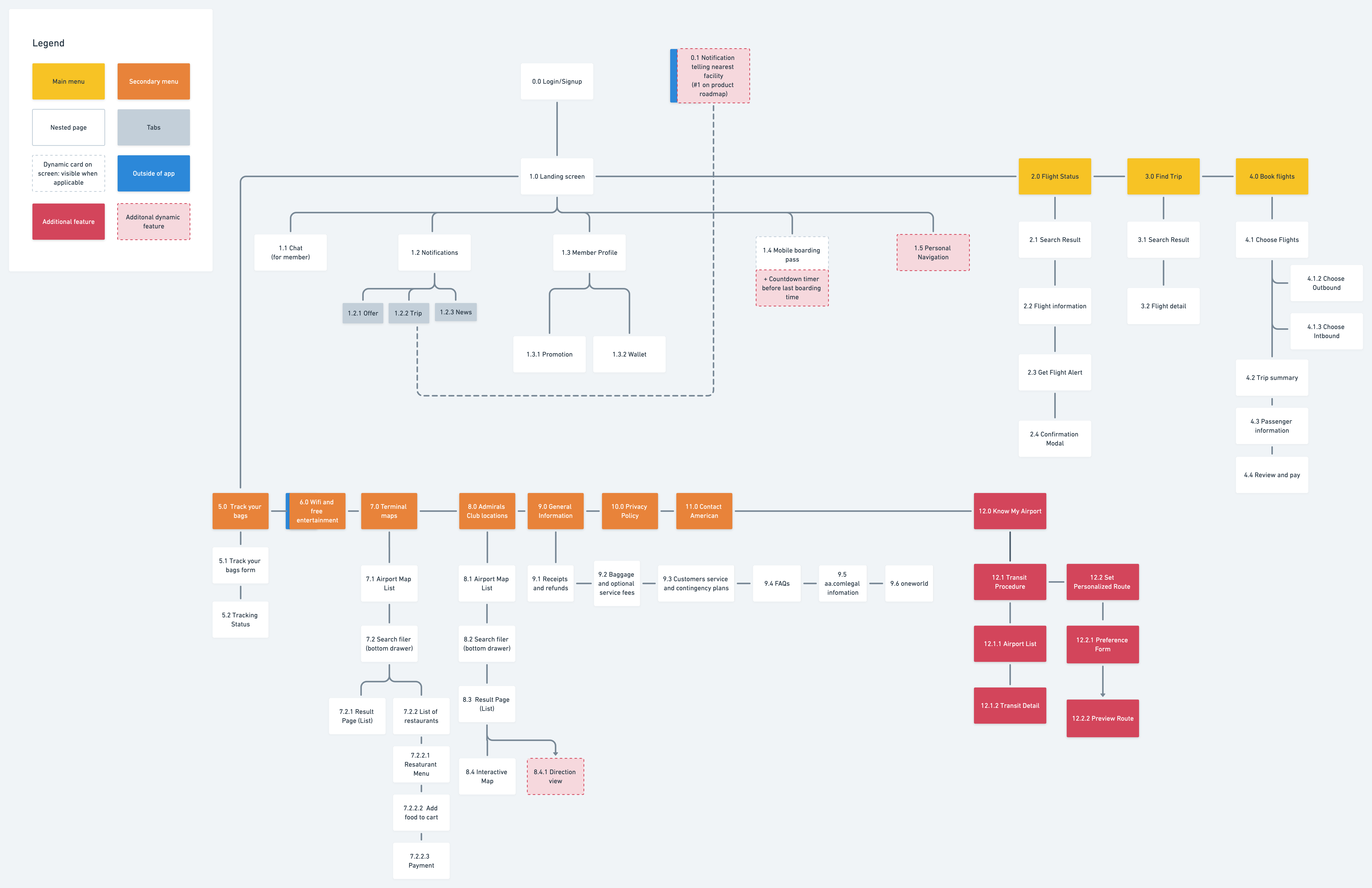
The features with top priority in the product roadmap were selected. I would like to see how they can fit in an existing product. So a sitemap was created according to the current mobile application to identify locations of the new feature based on how it can relate to other parts.
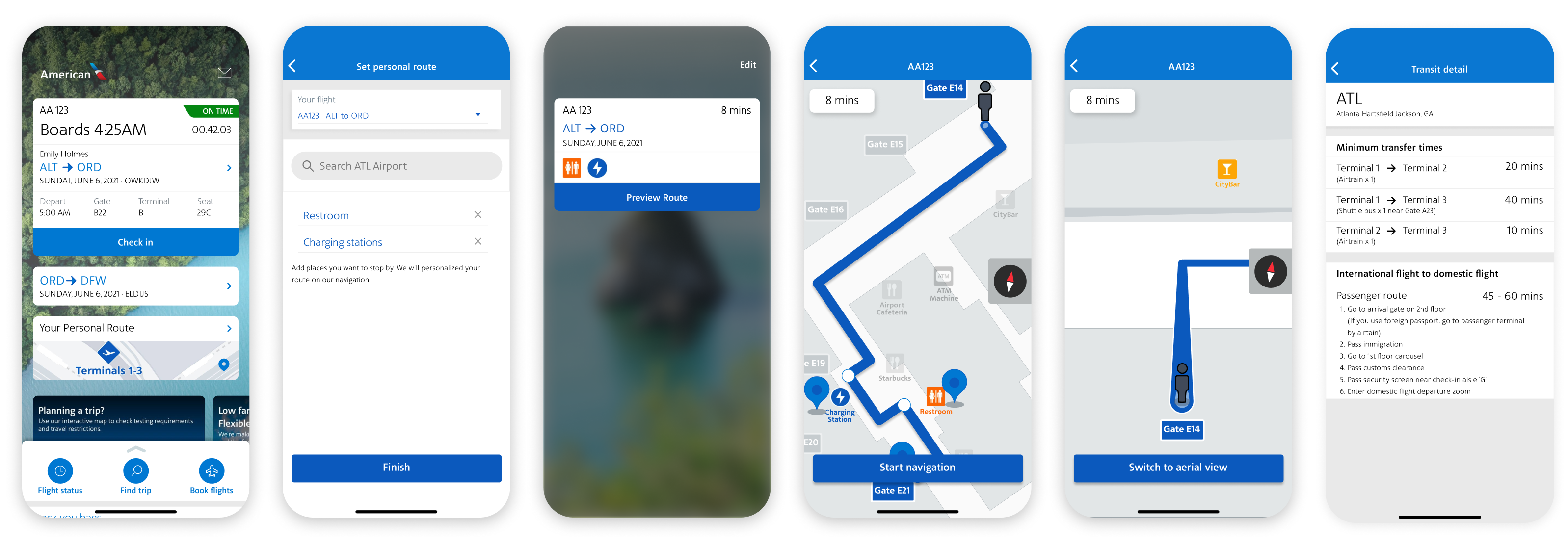
Since our problem is about airport experience, the new screens should then be close to the information about airports. So I grouped the new airport transit information under a label called ‘Know your airport’ next to the original terminal maps and the locations of their lounges.
One big characteristic for the current app is that the information on the screen is dynamic (show in dotted border), only showing the information the user needs depending on what stage they are at for flying.
Scroll to right or click on the image for viewing complete app map:
The UI Requirements of the key pages are documented to define what elements the new pages should include and what the users can perform for each elements. It was created based on the tasks listed in order to achieve the users goals.
See UI Requirements.
.png)
Here are some of the main screens that I have drafted referencing the current product. After a few versions done, I realized the more sketches I did, the more I gauged on how the information should be presented. I then move on complete the high fidelity wireframe with setting up a UI kit that applicable for this project (next section).
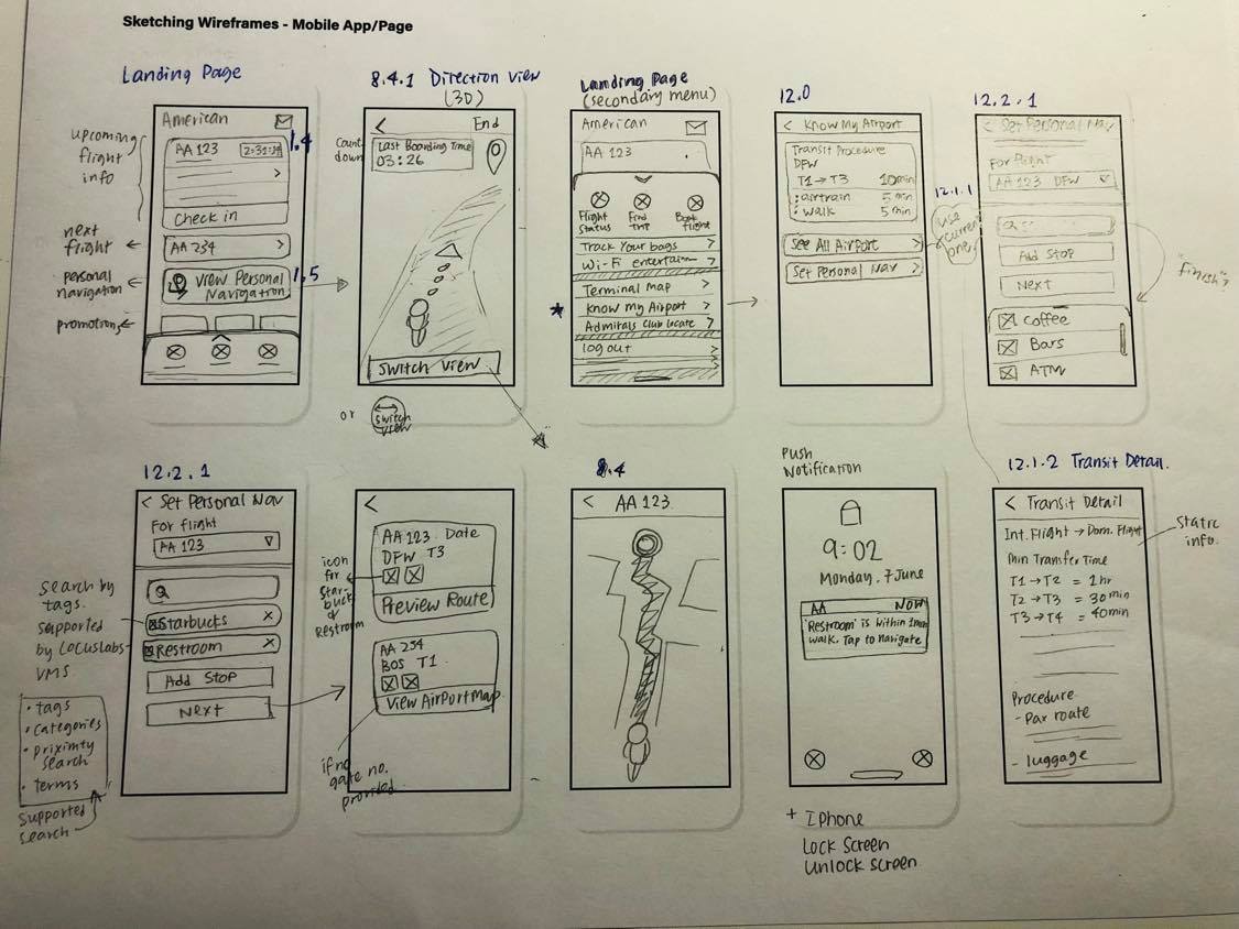
Low Fidelity Wireframes (Sketches)
High Fidelity Wireframes
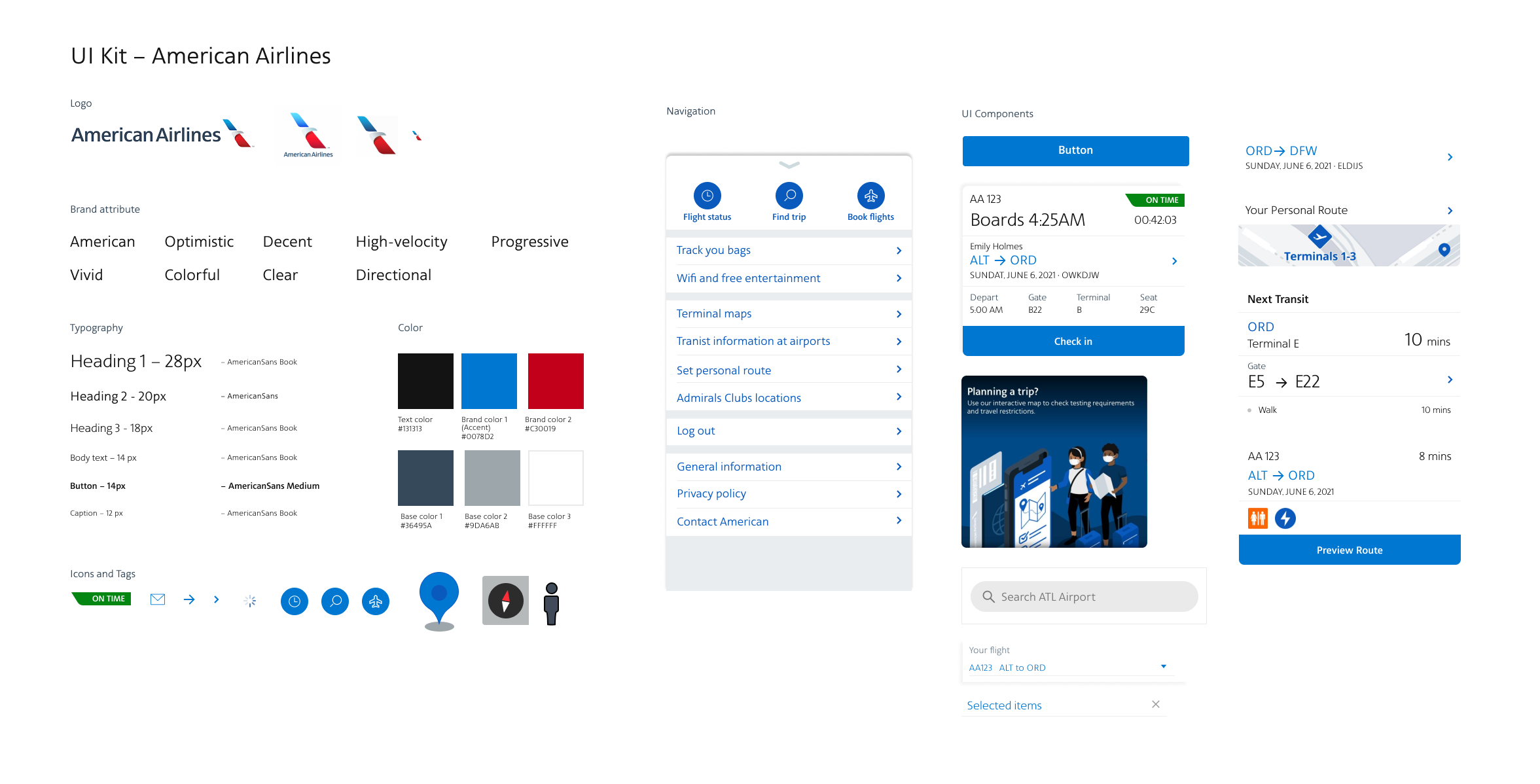
The style tile helped me set a clear vision direction and to understand the existing brand; the UI kit helps captured the reusable design styles and elements.
The Hi-fidelity prototype was tested with the tasks given to the participants identified in the UI requirements were the focus on making the prototype functional.
View PrototypeObjectives
Participants
Completion Rate
User is able to complete: 100% task
Error-free Rate
The percentage of tasks the user completed without errors or hiccups: 94%
because users may perform unexpectedly.
– Slips: x2
User consciously notice that the label was on the screen but missed it when land on it the second timeUser pressed the back arrow by mistake without meaning to do so.
– Mistakes: x4
3 users decided to go to Book a flight/Find a trip to start tasks 1.
1 users went to ‘terminal maps’ for task 2.
The transcripts were broken down into groups in order to find patterns and insights when users interact with the prototype. Through the insights, I hope to find opportunities for improvement and reiterate the design.
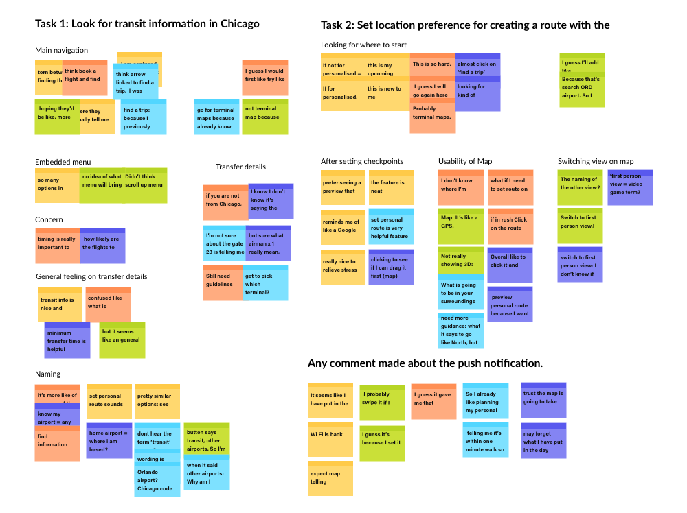
User Insights:
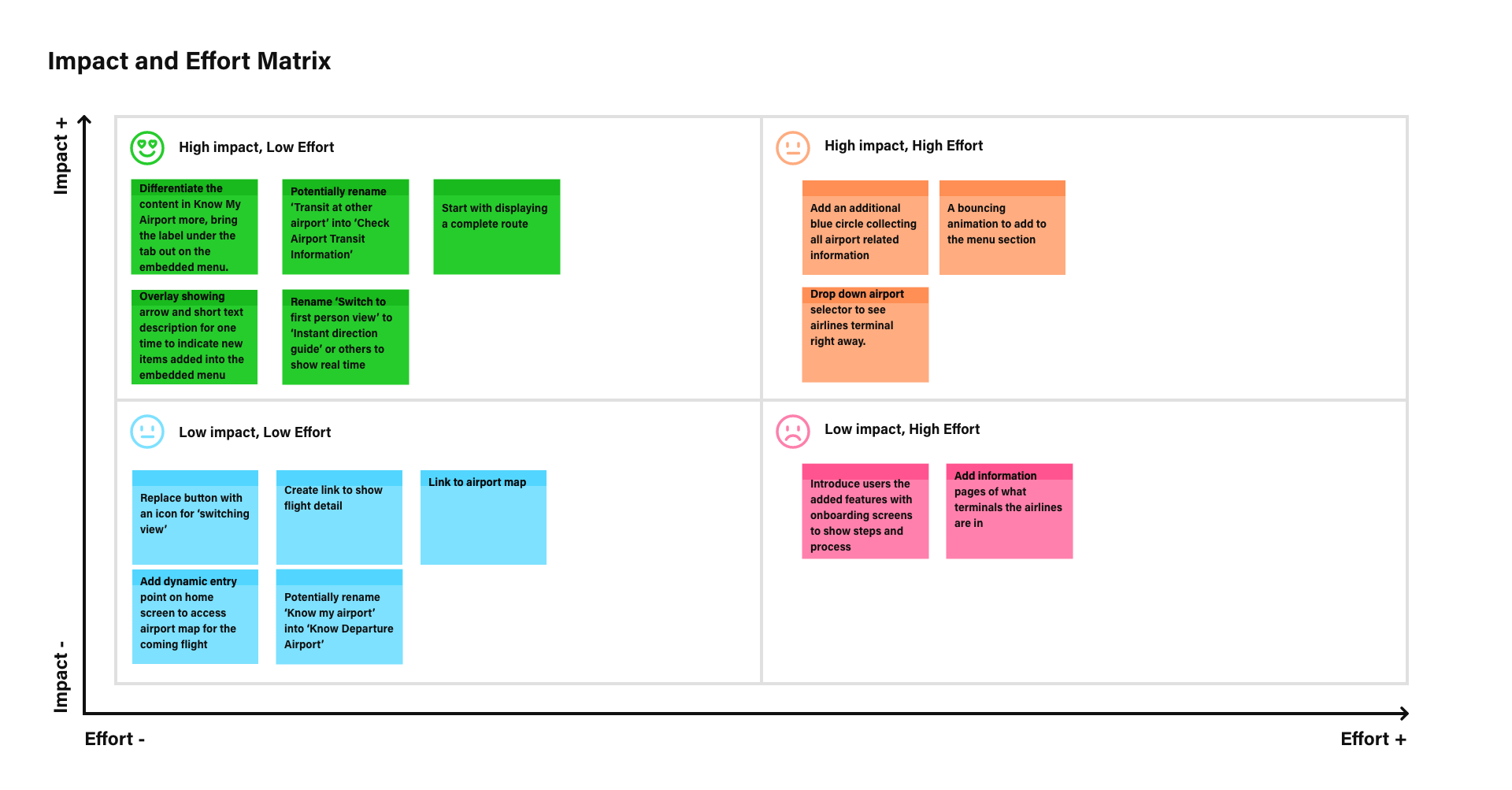
Recommendations & Priority Matrix
Recommendations:
To see which recommendations were worth working on first, I created a priority matrix and arranged them in terms of effort to spend and the amount of impact the revision would bring. Easier ones including renaming menu items will be worked on, while high effort one like adding bouncing animation on the menu section to increase discoverability will have to be reconsidered.
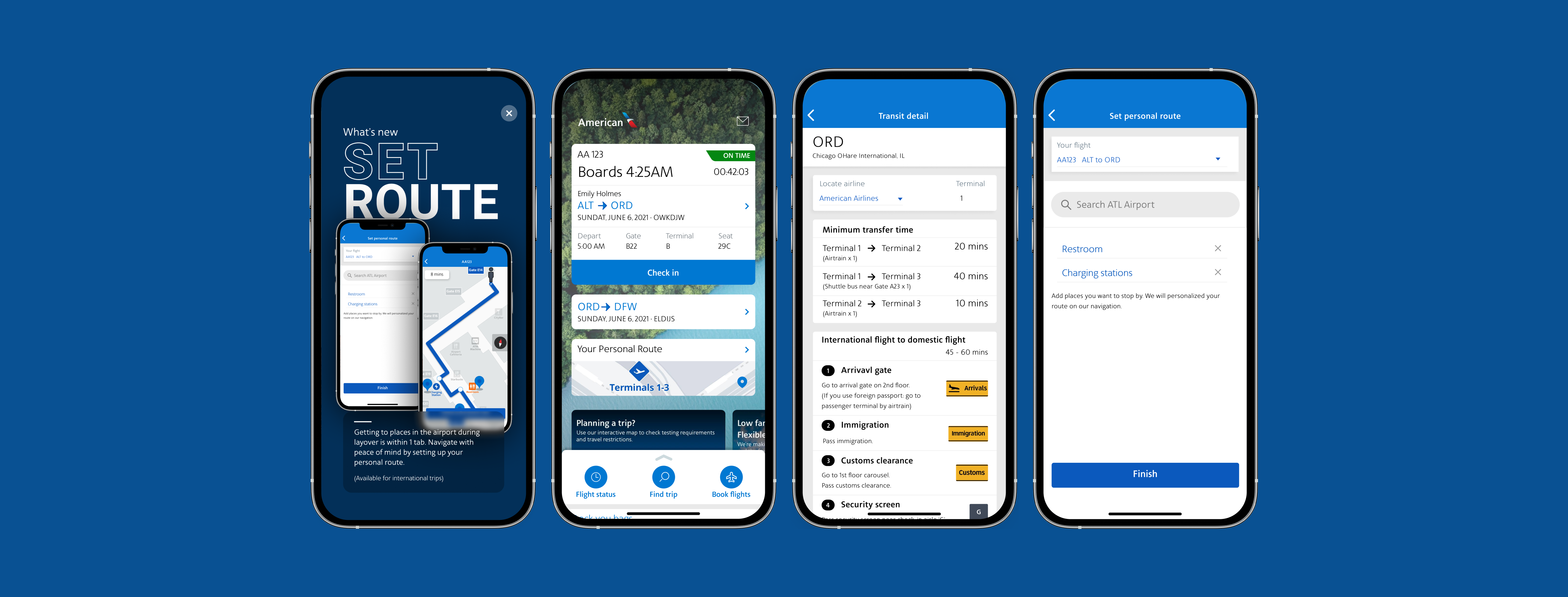
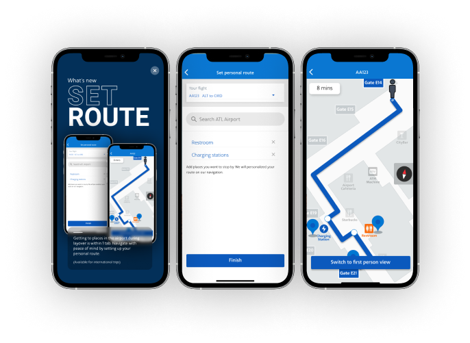
1. Added one onboarding screen like how news is normally announced when launching the application
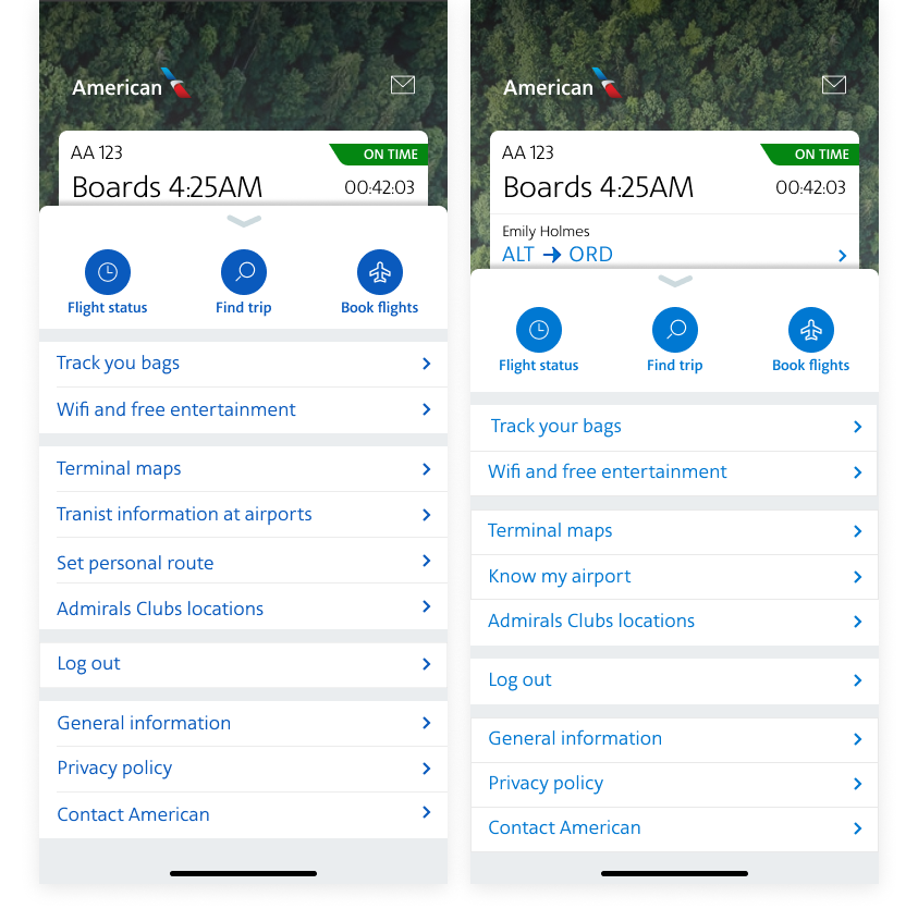
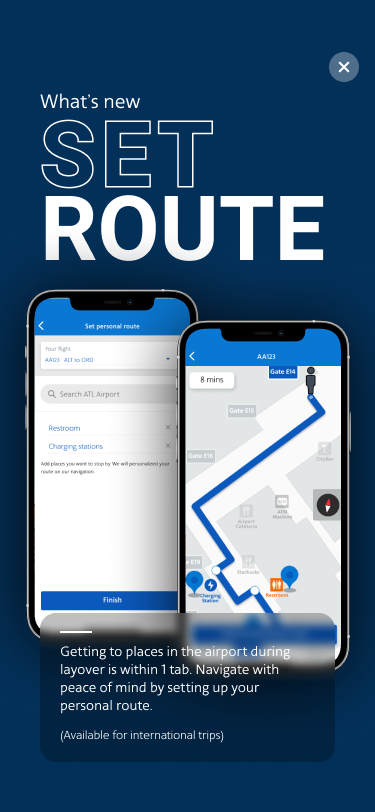
2. Brought 'transit information at airports' and 'set personal route' up to the main menu list
3. Renamed the two view settings so that users can understand what they mean right away
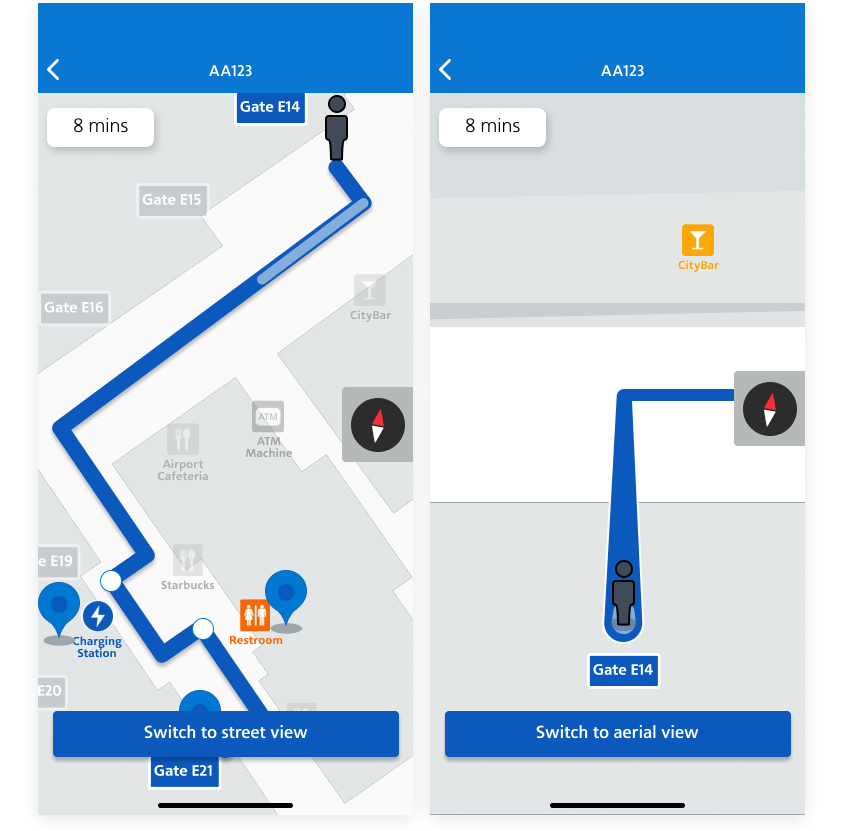
4. Updated UI on showing airport information for transit with the icons of relevant airport sign